
You are using an outdated browser. Please upgrade your browser to improve your experience.
Kin
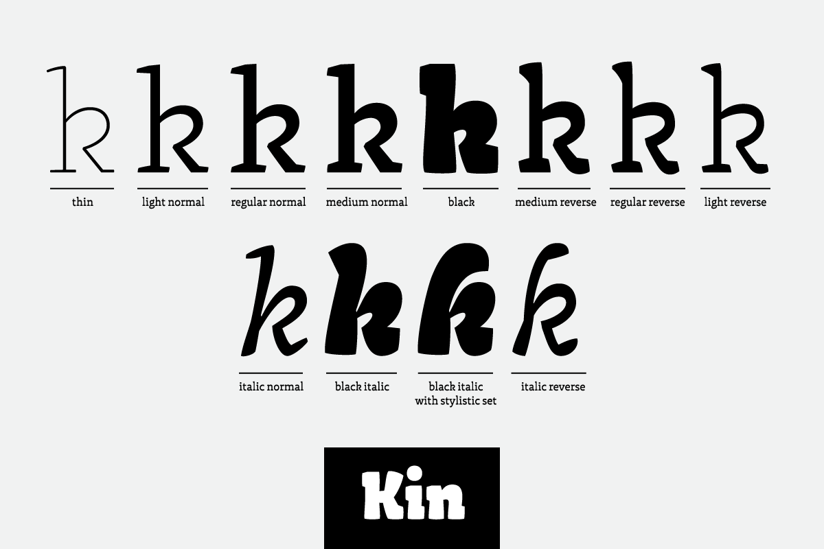
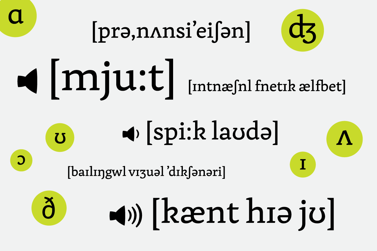
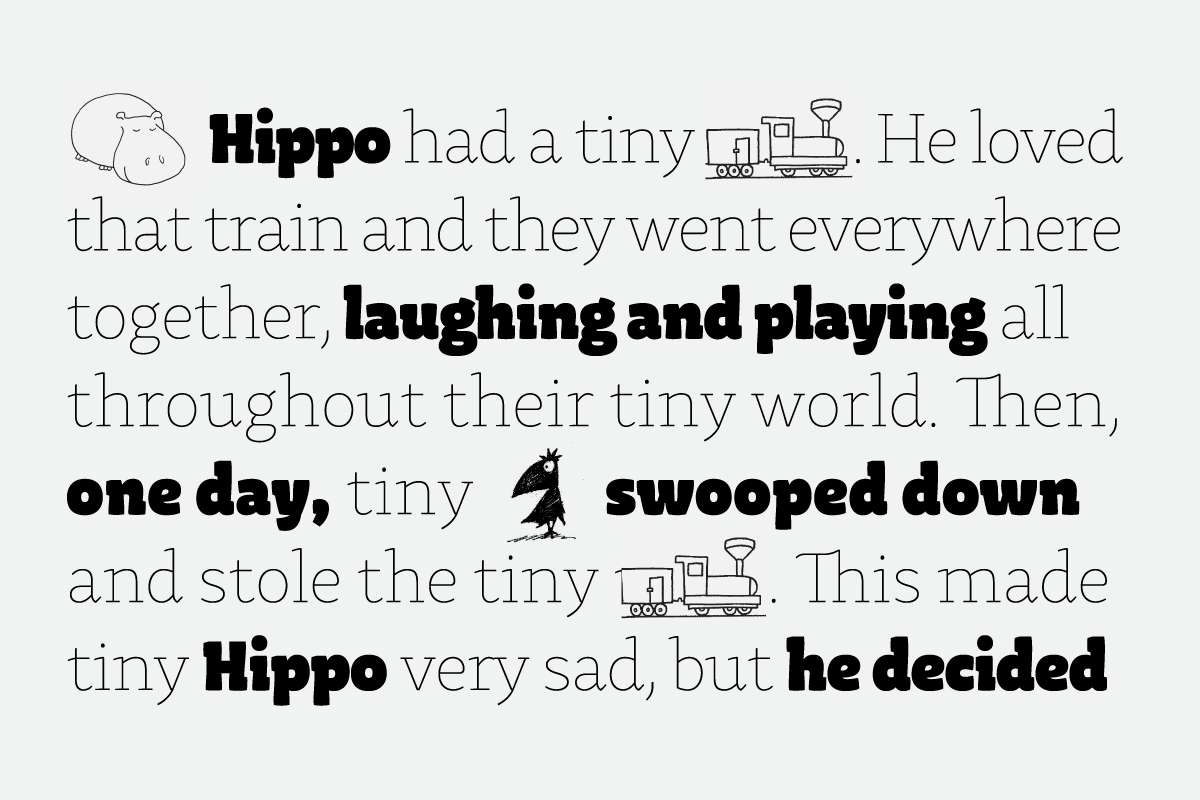
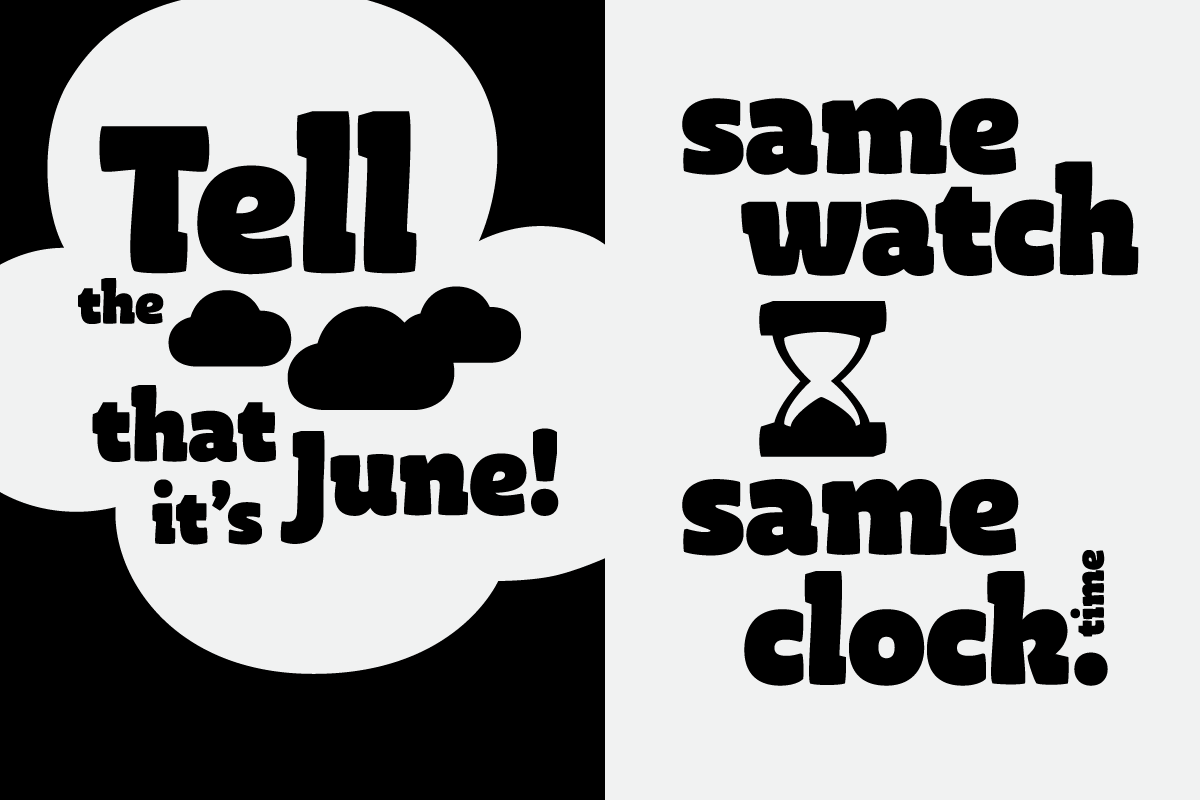
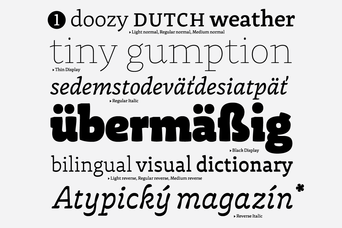
Kin is an unconventional serif type family which explores distinctive styles while maintaining consistency. The main goal of this project was to design a complex family system intended for editorial design especially for bilingual settings with two slightly different text type versions supplemented by an expressive and vivid headline type. Kin contains also phonetic support. The big challenge is to apply this contrast system to some non-latin scripts as well.
Slovakia
Sláva Jevčinová
Sláva Jevčinová is a graphic and type designer. Before attending t]m she graduated as a graphic designer with an MA from J. E. Purkyně University in Czech Republic. During that time she interned at Mota Italic in Berlin, and then started working for Fontwerk, a company specicializing in TrueType hinting. Since 2013 she is a freelancer and she regularly collaborates with the Rosetta Type foundry.
process
Decisive influences and first ideas
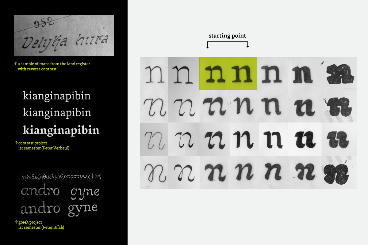
In the beginning, I was influenced by several aspects. I had in mind pictures of the old maps from the land register filled with calligraphy in reverse contrast. Another impulse came with school projects from the previous semester. The first one was the contrast project with Peter Verheul and the second was the greek project led by Peter Biľak.
Family planning
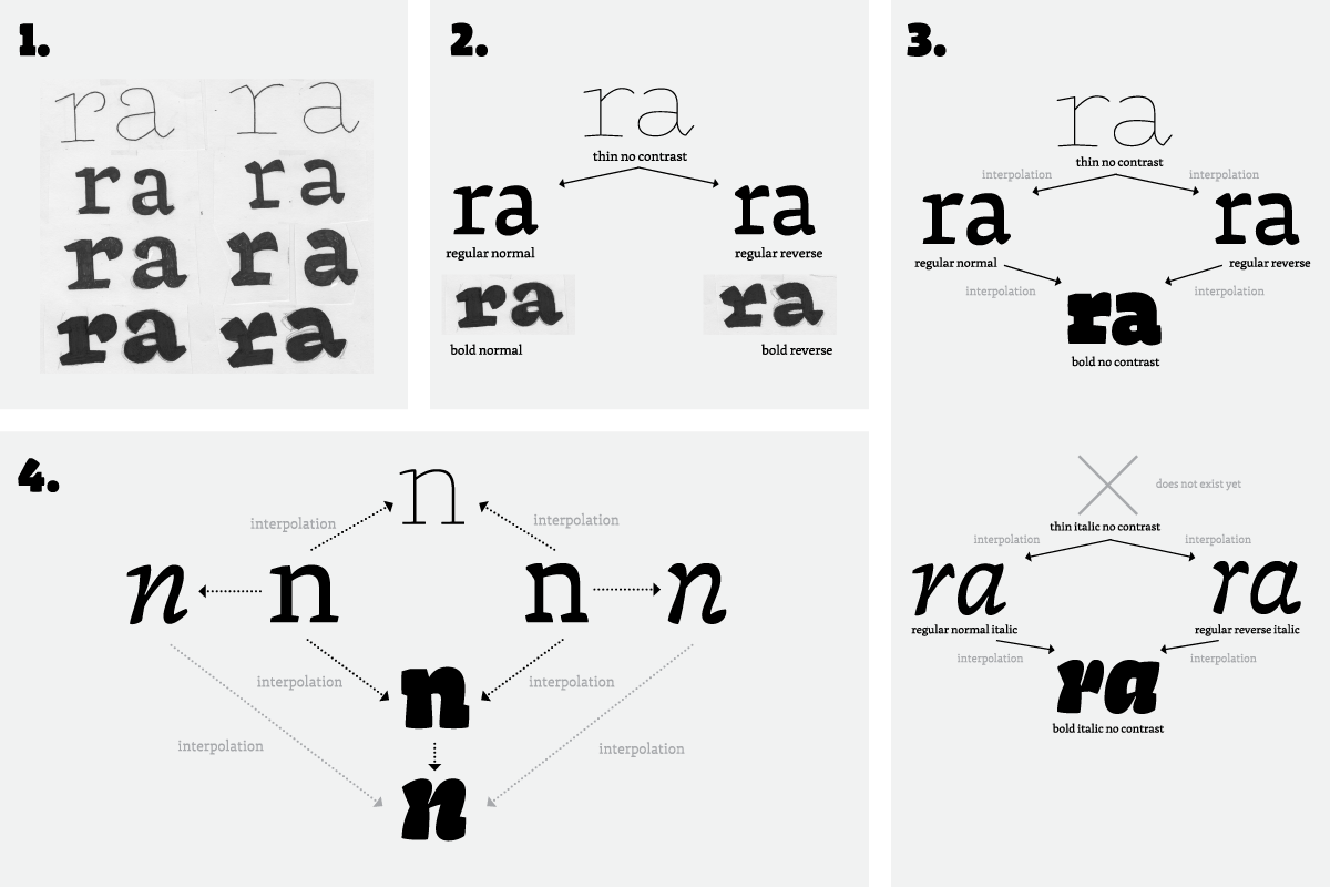
The first idea was to develop both contrasts in progressively heavier weights, but I wasn’t confident with the result as much as I would like to be. I found it to be an uninteresting concept requiring a lot of work. The next intention was to make it easier by sharing one skeleton form for both text type faces, but we would keep bold weights for both of them. Of course, for every action there is an equal and opposite reaction, so why shouldn't they share the thin and bold weights too?
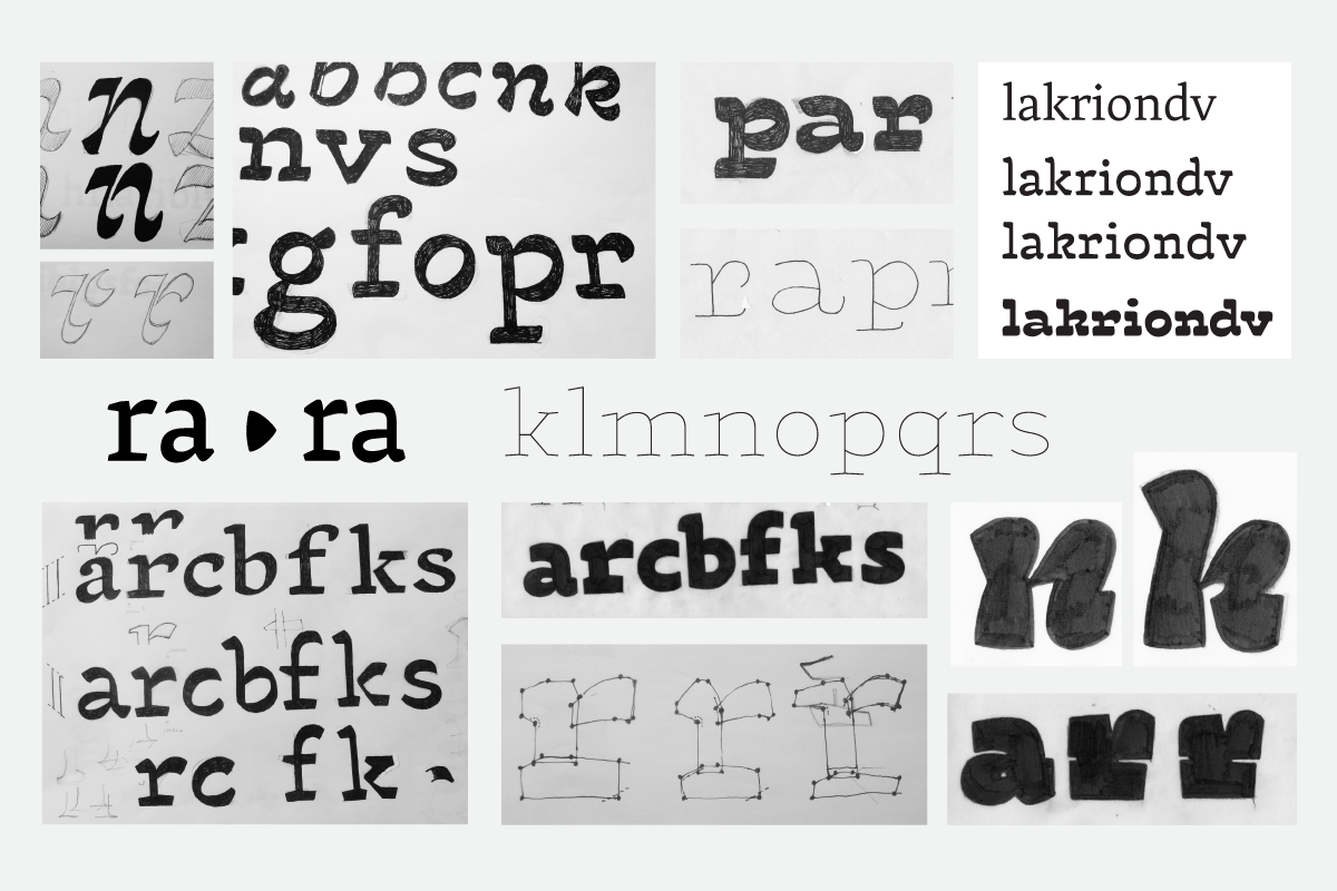
First sketches
I started with sketches based on maps from the land register, but I realised very soon that it's not at all what I really wanted to do. My goal was to focus on text type, which requires a totally different treatment. Therefore I decided to use my previous design from the contrast exercises as a reference for normal contrast and to create a reverse contrast companion for it. It was great to work on both of these styles, because I could start to compare them.
Non-latin scripts
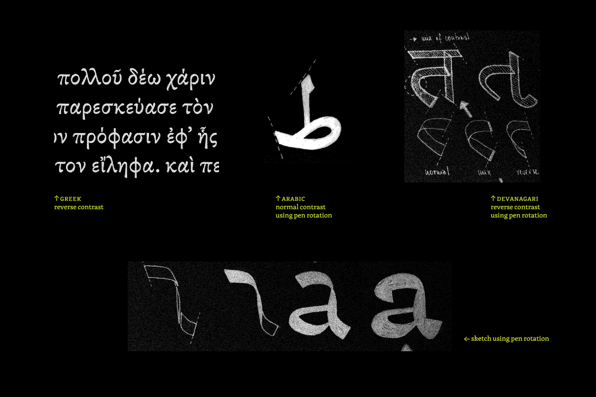
An integral part of my research was to find out more information about reverse contrast in general. This was the reason I started to explore more non-latin scripts. The Greek reverse contrast style and greek projects from first semester greatly influenced my reverse contrast italic. I tried to work with pen rotation (inspired by Arabic and Devanagari) as well but I could not apply it nicely for each letter. This method only works in certain cases.
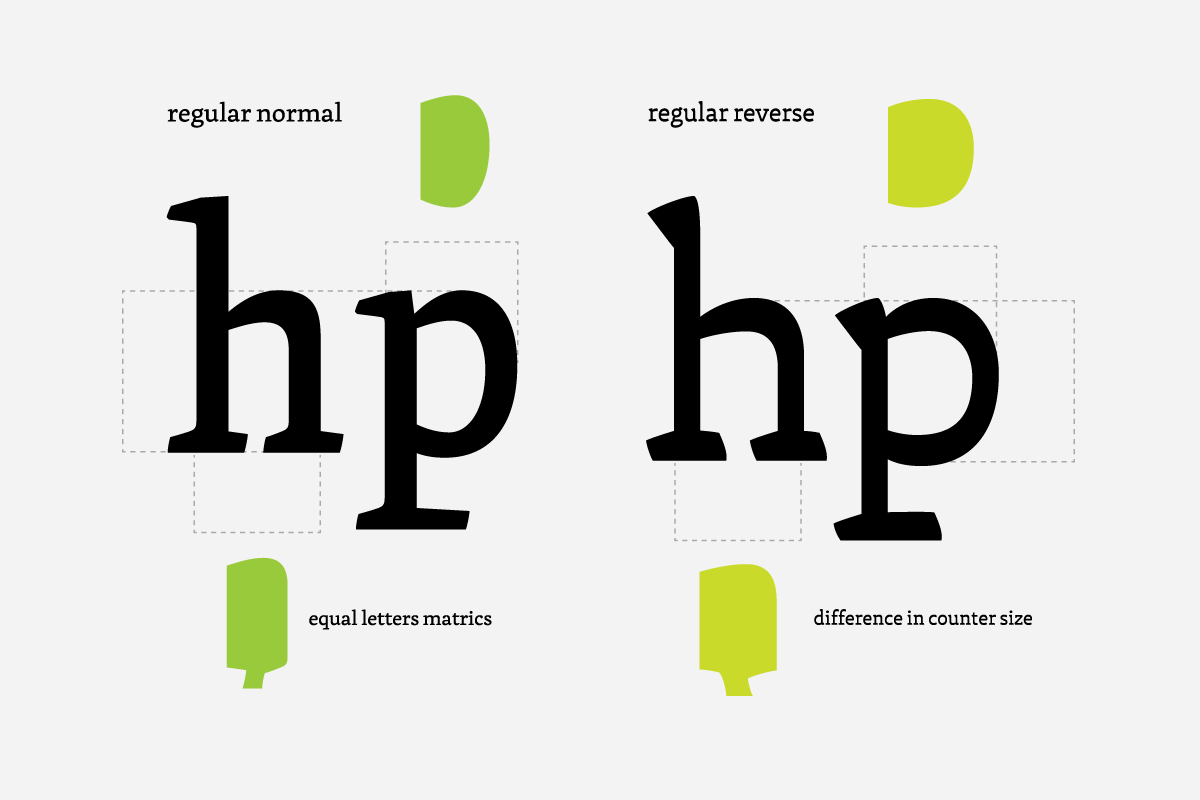
Optical comparison (width, height)
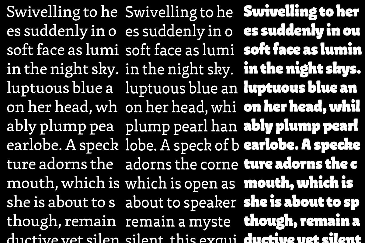
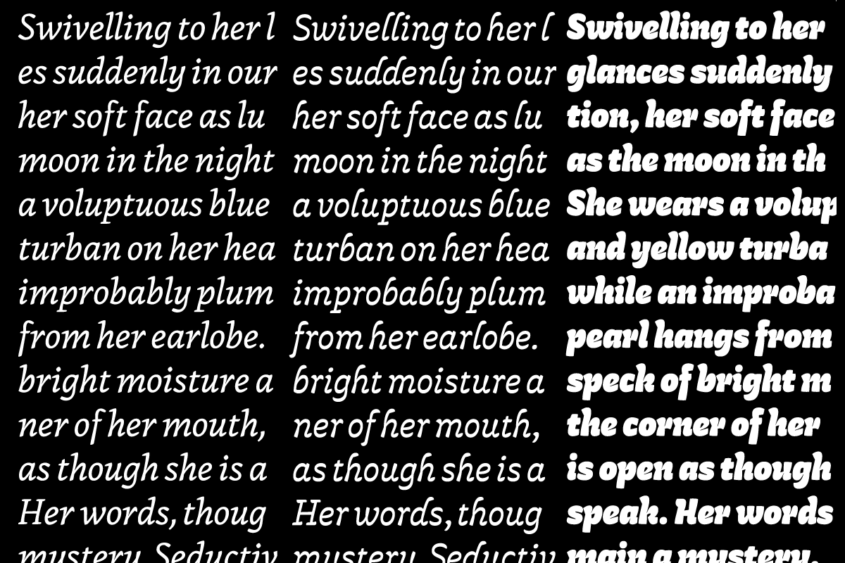
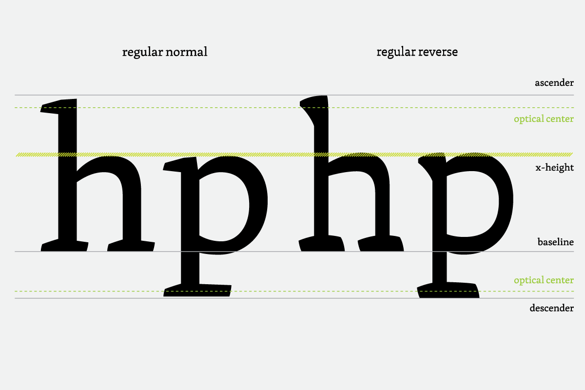
I used the same metrics in the first step. That showed me how different they are, and what different optical treatments they require. Normal contrast seems to be much narrower and its x-height looks optically higher than the x-height in reverse contrast. Reverse contrast has nicely open counters, and seems to be more legible. This conclusion gave me hints for the next process, which was to achieve optical and aesthetic balance between them.
Optical adjustments and colour match
I decided to focus on the shapes of their counters, which were completely inconsistent before. Equal metrics: unequal counters, unequal metrics: optically equal counters.
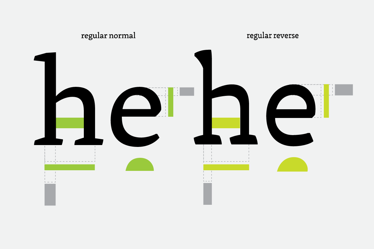
It’s very tricky to get the same colour impression from both contrasts. Optical illusions play a huge role in their appearance. To get as close as I could, I used the same stem values, but in the opposite way. The value of the vertical stem in normal contrast is equal to the value of the horizontal stem in the reverse contrast and the other way around.
Optical balance
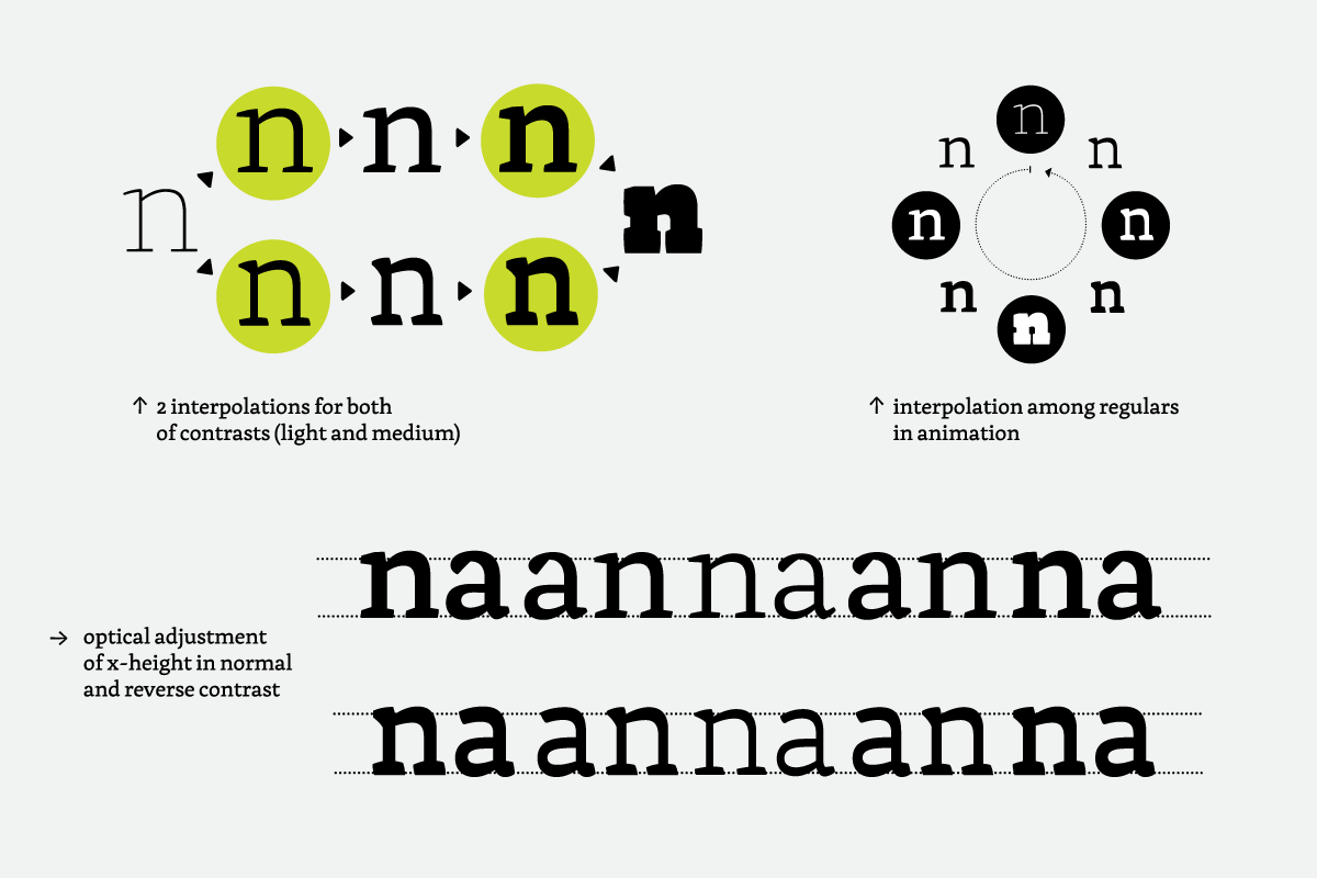
I went a bit lower with the x-height in the normal contrast to achieve optical balance in both contrasts. This treatment nicely opened counters as well. Another optical correction involved the height of ascenders and descenders. There is a much heavier top part of the ascender and bottom part of the descender in the reverse contrast. So basically, I could go lower with the ascender and higher with the descender in normal contrast.
Letters in detail
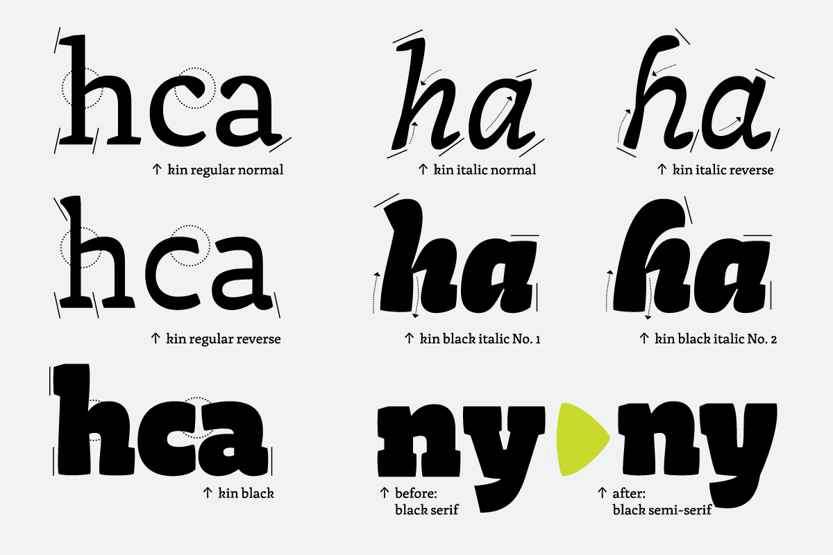
I realised that I can follow the pen direction, to distinguish both of contrasts more in details. Therefore I cut the serifs in a right slant for the normal contrast and in a left slant for the reverse one. The serifs stayed vertical in black and thin display styles as a connection between them. Another adjustment was in stroke connections on vertical stems. I pushed the curve lower in normal contrast and on the other hand I went a bit higher in the reverse contrast, to emphasize horizontals. Despite the fact that the relationship between the two regulars is so close, I wanted to leave more space for diversity in the italic, where it is acceptable. The main difference is in the leaning direction of the ascenders. Each of the italics has a companion in the black weight too.
Interpolation
Because an interpolation requires fully compatible masters, I used my “old” black serif style instead new semi-serif version for this purpose. I wasn’t fully satisfied with the result, therefore I had to fine-tune them a bit. The most important thing was to get an optical centre for x-height position. Their compactness allowed me also to make a short animation, explaining the whole process in the circle.
Figures and diacritics
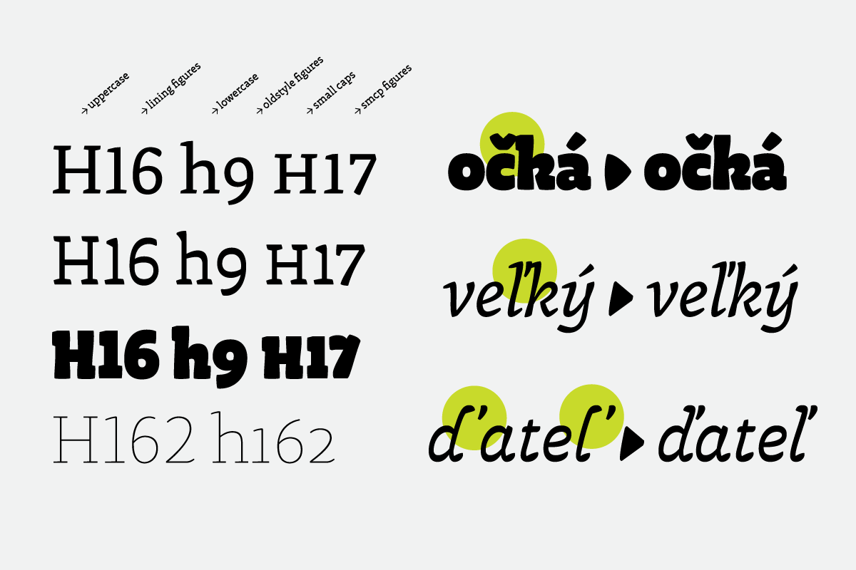
Kin contains three sets of figures: lining figures, old style figures and small cap figures. I made one exception in height for lining figures. Their height is a little bit below the cap height in normal and reverse contrast, but I aligned them with the cap height in the black and thin display weights.
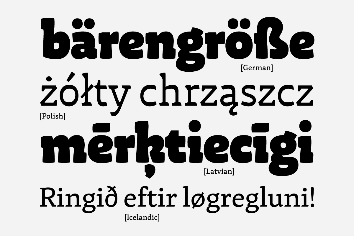
Designing accents requires dealing with some problems too. They might clash with another letter, or create big space between them. Therefore it's necessary to use contextual alternates. This type family is capable of typesetting Latin-based languages.


