
You are using an outdated browser. Please upgrade your browser to improve your experience.
Shequalin
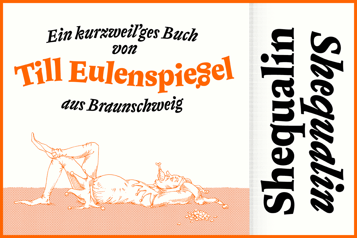
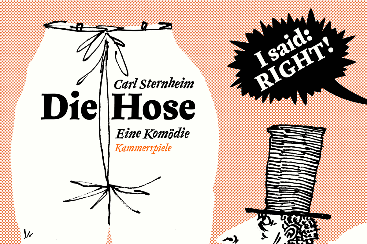
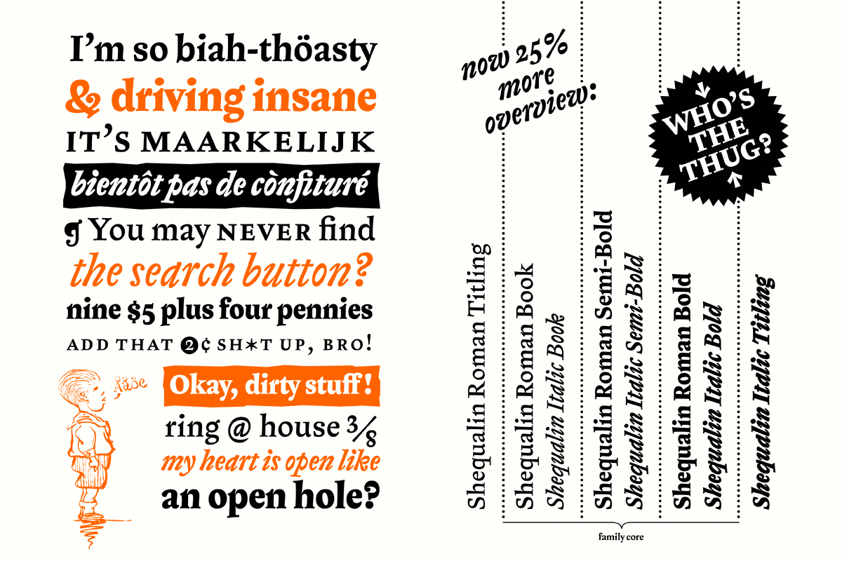
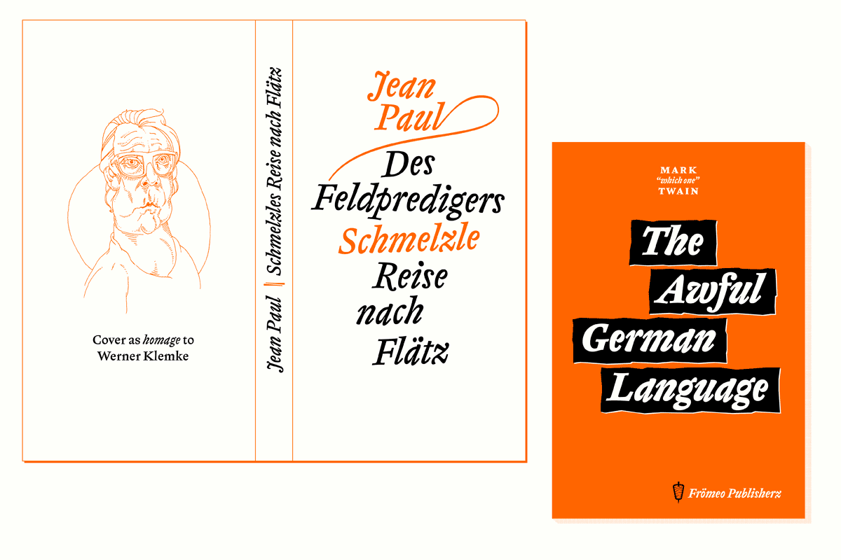
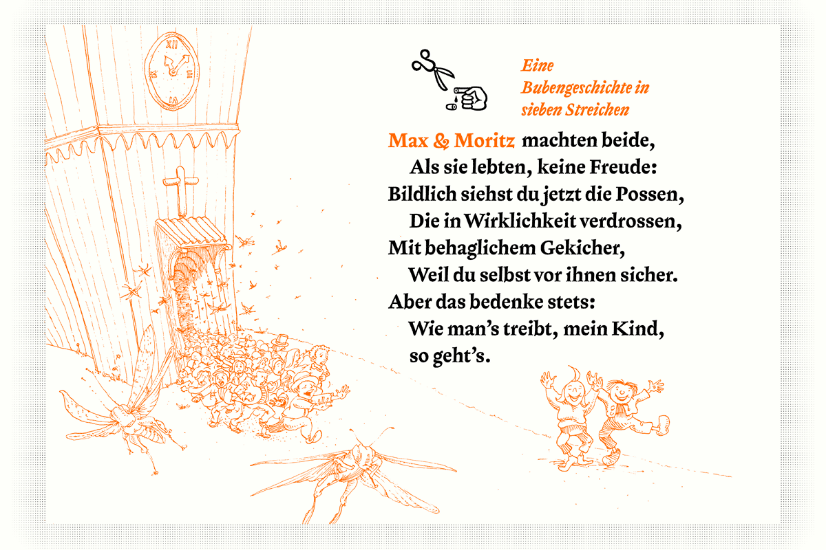
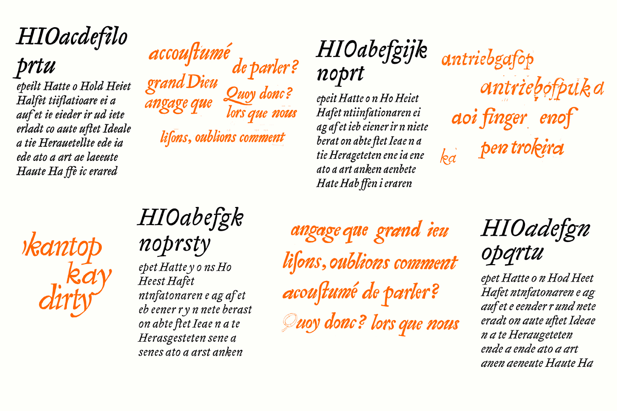
Shequalin [ʃɛ-'kwa-lɪn] is designed for sophisticated humoristic literature and all kinds of typographic shenanigans. Be it satirical or dadaistic poetry, escapist or fictive novels, d’playful Shequalin seamlessly suits works by masters of the comical word. For the reader’s alertness, it rhythmically drops in oddities without distracting from the reading flow. In order to create a more severe and fervent contrast, the roman and italic were designed independently and merged later, creating a dynamic sense of tension and blatancy in Shequalin. Subtlety can sweetly go to sleep!
Germany
Mark Frömberg
Mark Frömberg (1984) is a native Berlin-based [type] designer and illustrator. Before TypeMedia he received his BA in Communications Design at the University of Applied Sciences (Berlin 2012) where he focused on type and illustration which never happened to detach since. Working as an independent designer since 2008, he likes to combine systematical structure with unpredictable moments. Mark disguises complexity behind a clear decency with a strong, saucy wink, augmenting the outcome with lots of layers to discover over time.
process
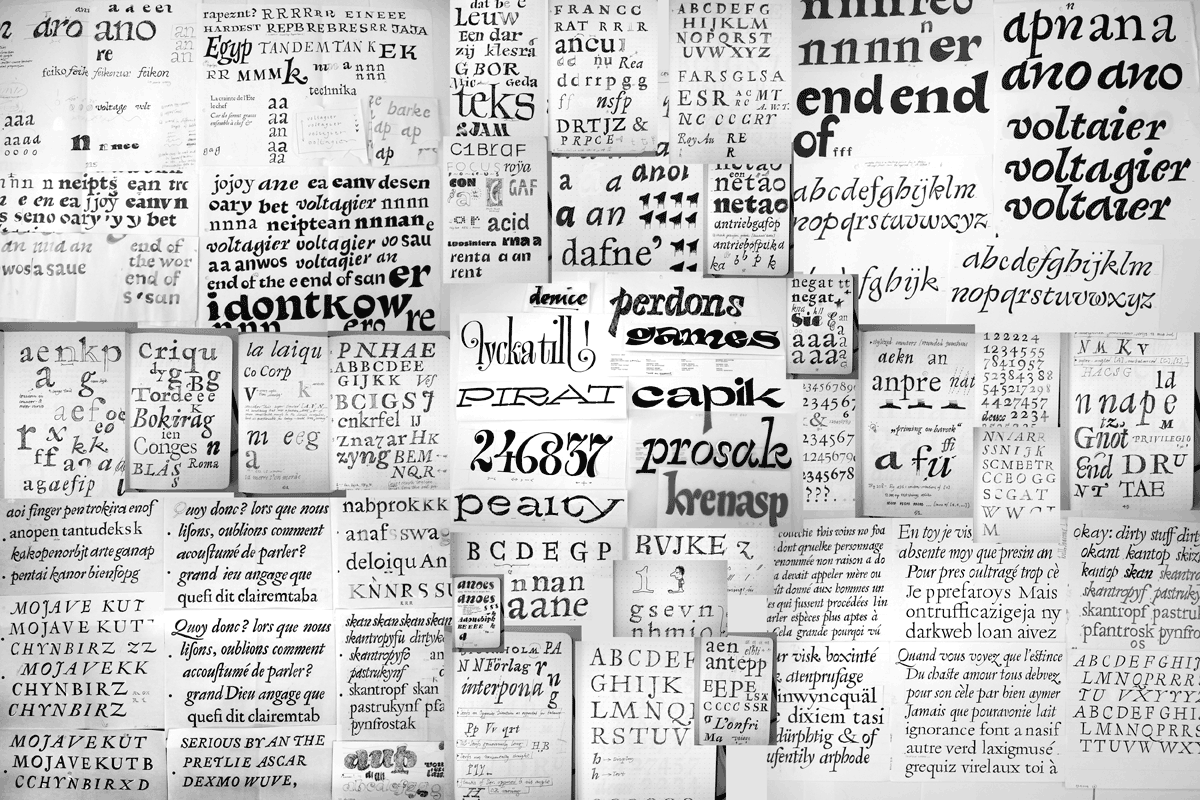
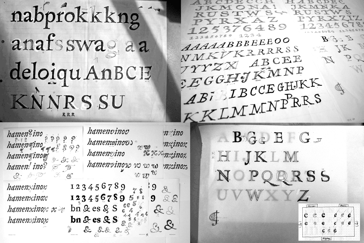
I started my visual research process pretty much by hand. I filtered the seen input (basically baroque italics, greek & civilité) by every technique I could imagine to be helpful to carve the desired flavour out of nothing. I made weird TypeCookers to extend my horizon, sketched odd and interesting features from old books set in (sometimes corrupt) hot metal, got dirty with the broad brush, speedball and markers, wrote with broad nib and drew details with its pointy edge.
I didn’t want to extract the italic out of the roman, but rather design both parallelly, influencing each other during the process and come up with a richer bouquet of design vocabulary. Most of these experiments didn’t work at all when tried in other letter combinations. Decisive elements of both cuts should be a modulated stroke (flexible shadow axis) and varying angles of certains stems, keeping the rhythm alive.
So I started a long iteration of rapid prototyping, creating a lot of rather tentatively drawn fonts out of the hunkiest drawings in order to set paragraphs and judge the different characters and particular effects of features in every depth of detail.
This was pretty tedious, since I started to drown in all the in- and output. I had no clue how to decide on things, kill darlings, distill the concentrate out of it. I got almost trapped in a neverending process. But i didn’t. It was very important and hard to balance between keeping a humorous tone and avoiding a goofy circus flavour.
I decided to make the typeface lively and quirky (meaning things like wiggling baseline or x-height) by the design itself and not by alternating letters that are triggered by code. Since I aimed to make a text face, spotting each font’s native size (in which it feels most at home) helped to exclude.
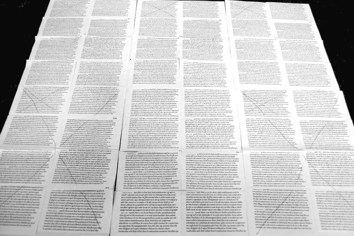
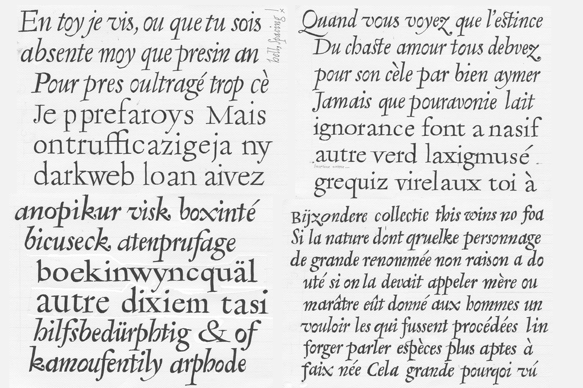
At next I wrote a python script that combined every roman with every italic in paragraphs. I could investigate all the pairings rationally, but also with a great deal of gut instinct blended in. One pair caught most of my attention. It had the tension and vivacity I seeked.
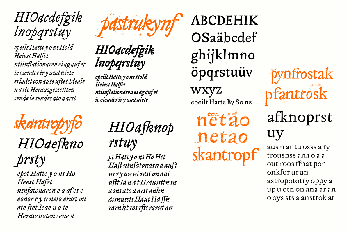
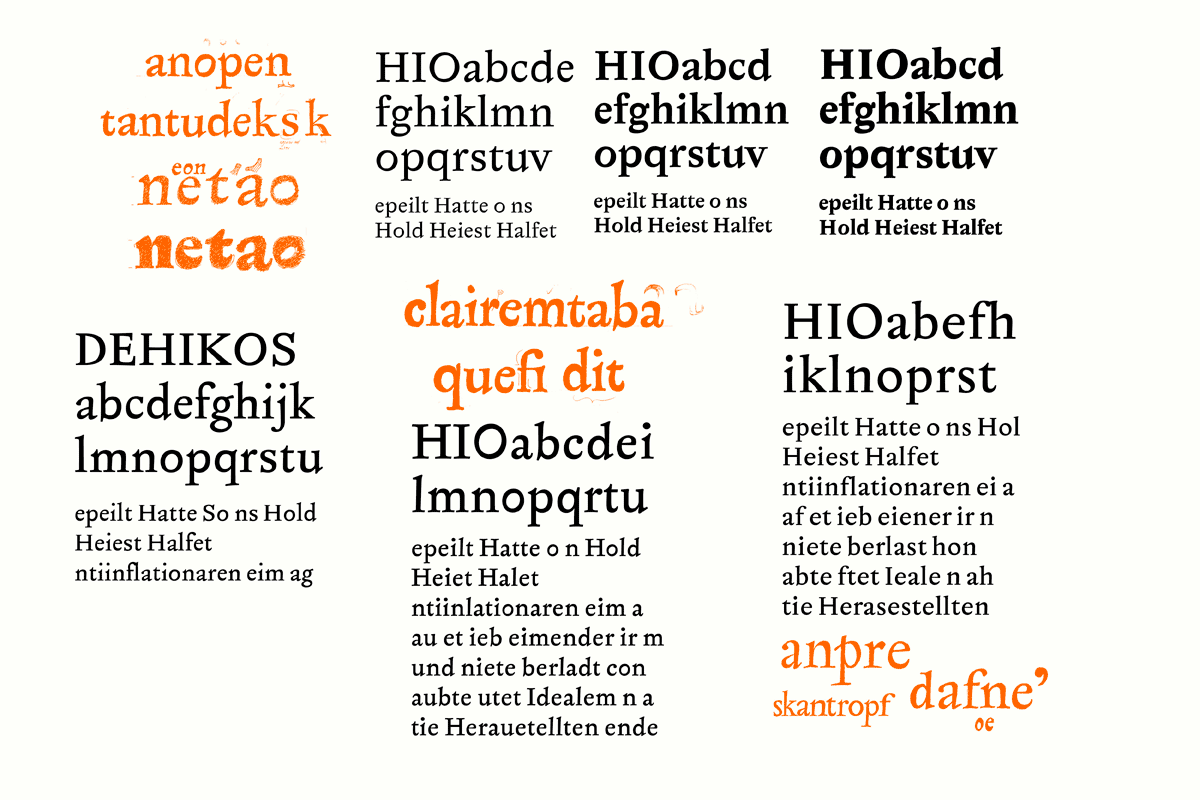
From here on it was all about cleaning things up, tying the letters into word shapes, developing the rhythm, finetuning the sizes, contrasts, colors, weights, etc. to render a suiting roman-italic-pair. The character set got expanded for everything that sophisticated typography requests. Small caps, diverse figure sets, diacritics, symbols.
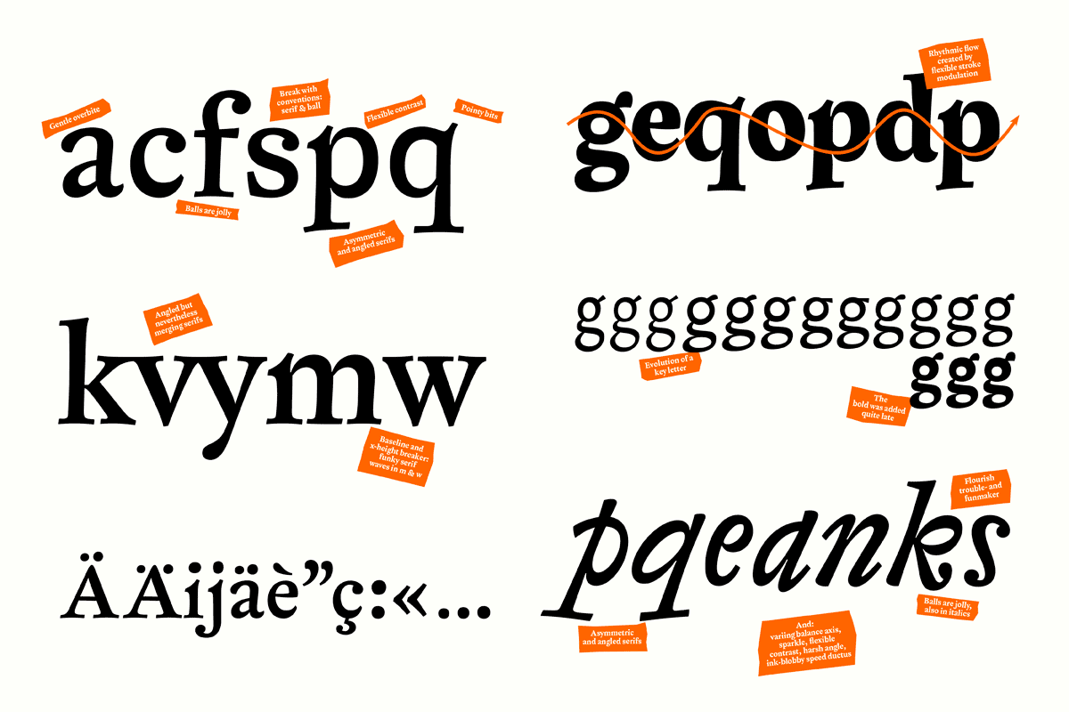
The design is based on a non-modular structure, yet it needed to keep consistency in certain places. Clashing combinations needed to be fixed either with the design itself or via OT-features and substitutes. The diacritics contained lots of opportunities for adding a certain spice to the typeface.
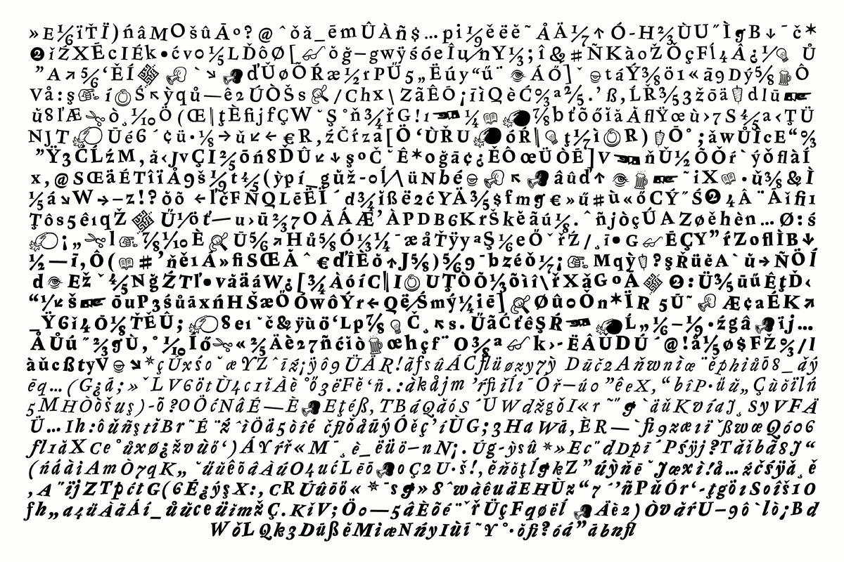
The character set grew and I added illustrative elements. They are interpolatable throughout the weights. These fellows are supposed to work as inline symbols in text as well as set larger as vignettes or paragraph openers.
Suddenly the year was over and the process needed a break. There are still things to do but typefaces need to ripe and mature over long time. Taking some distance is one of the most vital parts here. That’s what I do – for not too long! Let me know if you are interested in a less brief insight of the process.


