You are using an outdated browser. Please upgrade your browser to improve your experience.
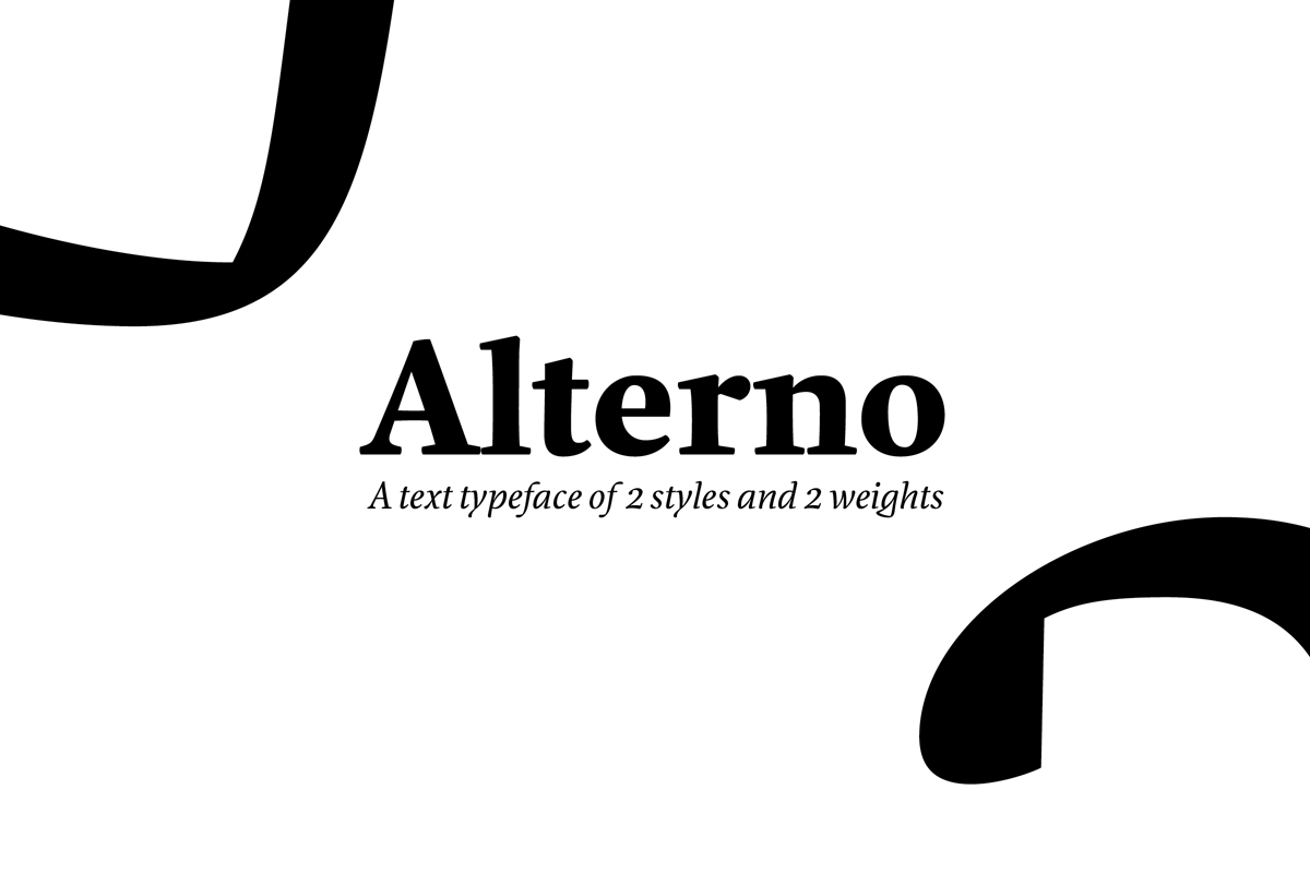
Alterno
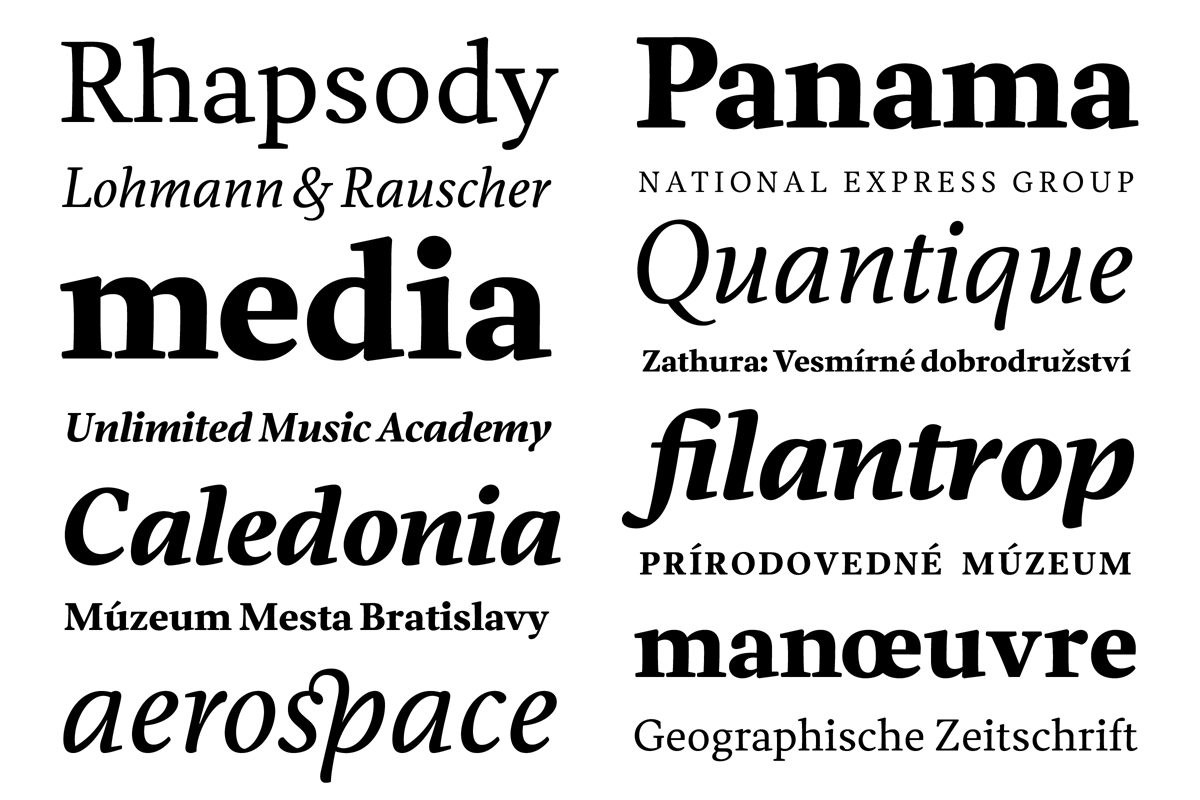
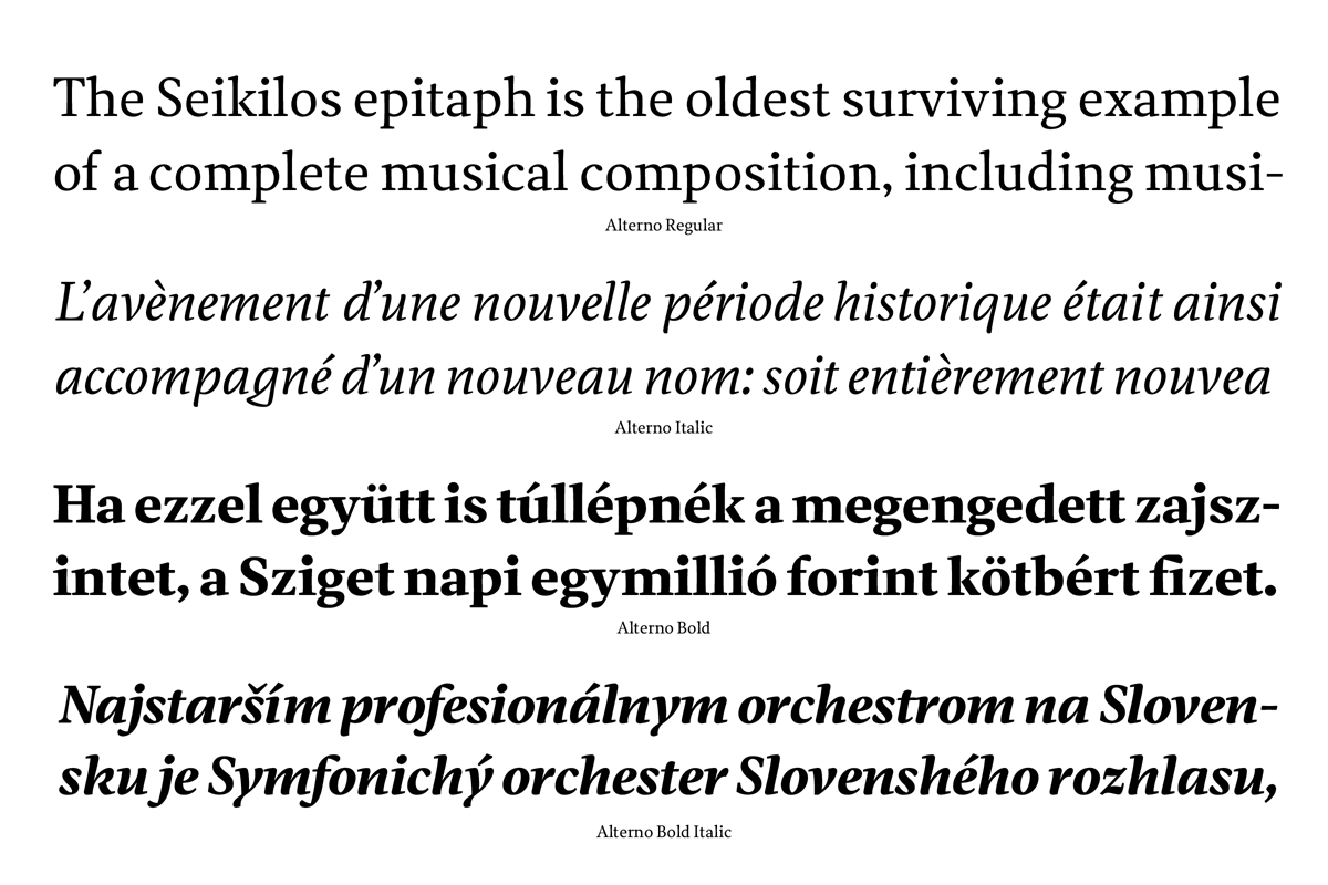
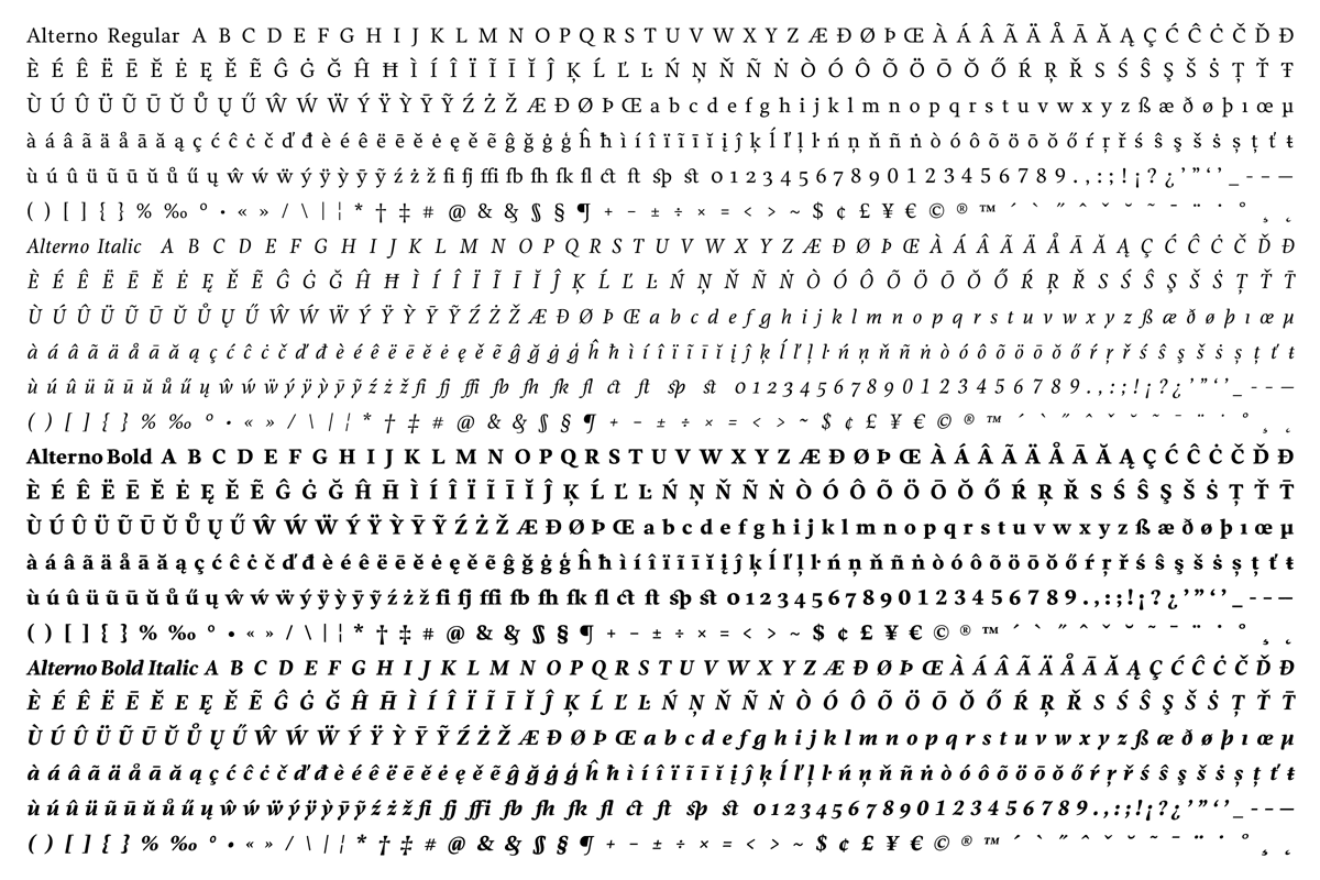
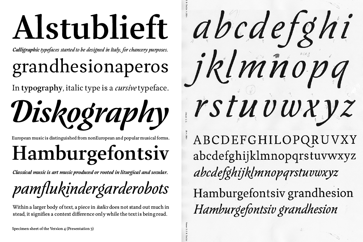
Alterno began as a sort of interest to explore the relationships between roman and italic styles. As the project developed the initial idea of the two opposite directions was move aside to make the typeface work equally well in small reading sizes. Alterno explores the rhythm and texture of sensitive text face and combines serious and static nature of the roman faces with more expressive and dynamic italic in harmonious whole. At the moment the type family contains two weights, regular and bold but it’s planned to expand to a much wider range of weights. Although the typeface was primarily designed for books and magazines it perform as well in display sizes as different medias.
Slovakia
David Chmela
David Chmela was born in 1985 and live in Slovakia. He started to study product design but soon noticed his passion for graphic and type design and applied to the Academy of Fine Arts and Design where he later studied and earned Masters in graphic design, specialised in typography and type design. During that time he’s also been working as a freelance graphic and type designer on a different projects with commercial and cultural background. After the TypeMedia course he would like to continue as freelance designer with focus on type related projects.

process
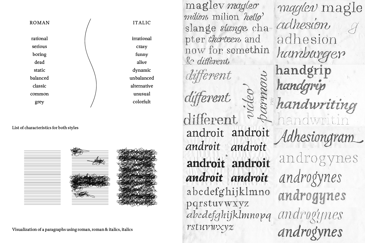
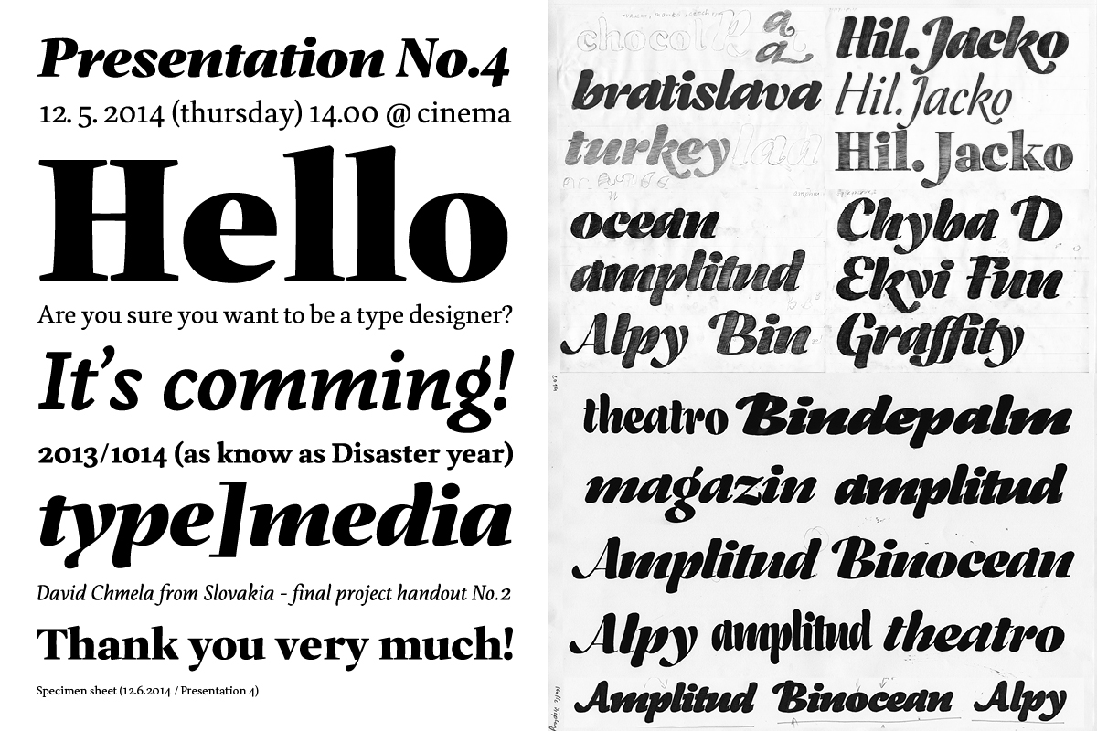
Before the first presentation of our ideas, I was sure that I wanted to design a text typeface. I’m a big fan of sans serif typefaces but I wanted to try something else. A text face that deals with contrasted shapes with a certain degree of humanity was a brief for a good challenge. A secondary impulse to make the text family more interesting was the idea to explore the relationships between roman and italic style. The first thing I did was a list of characteristics that the individual styles should contain. Then it was easier to start with sketching and getting closer to the actual shape of the letters.
After the direction for the roman style was provisionally defined, the italic was still a step behind. Here you can see the four different italics I made. I decided to go with the one on the bottom because that described best the opposite side of the roman, and I was most satisfied with the character. After a few tryouts with a smalI noticed that the italics were way too different from the roman so the next step was to get them closer to perform as nicely as possible. On the sketch is the first version of the roman and early italic version which was replaced by the new version.
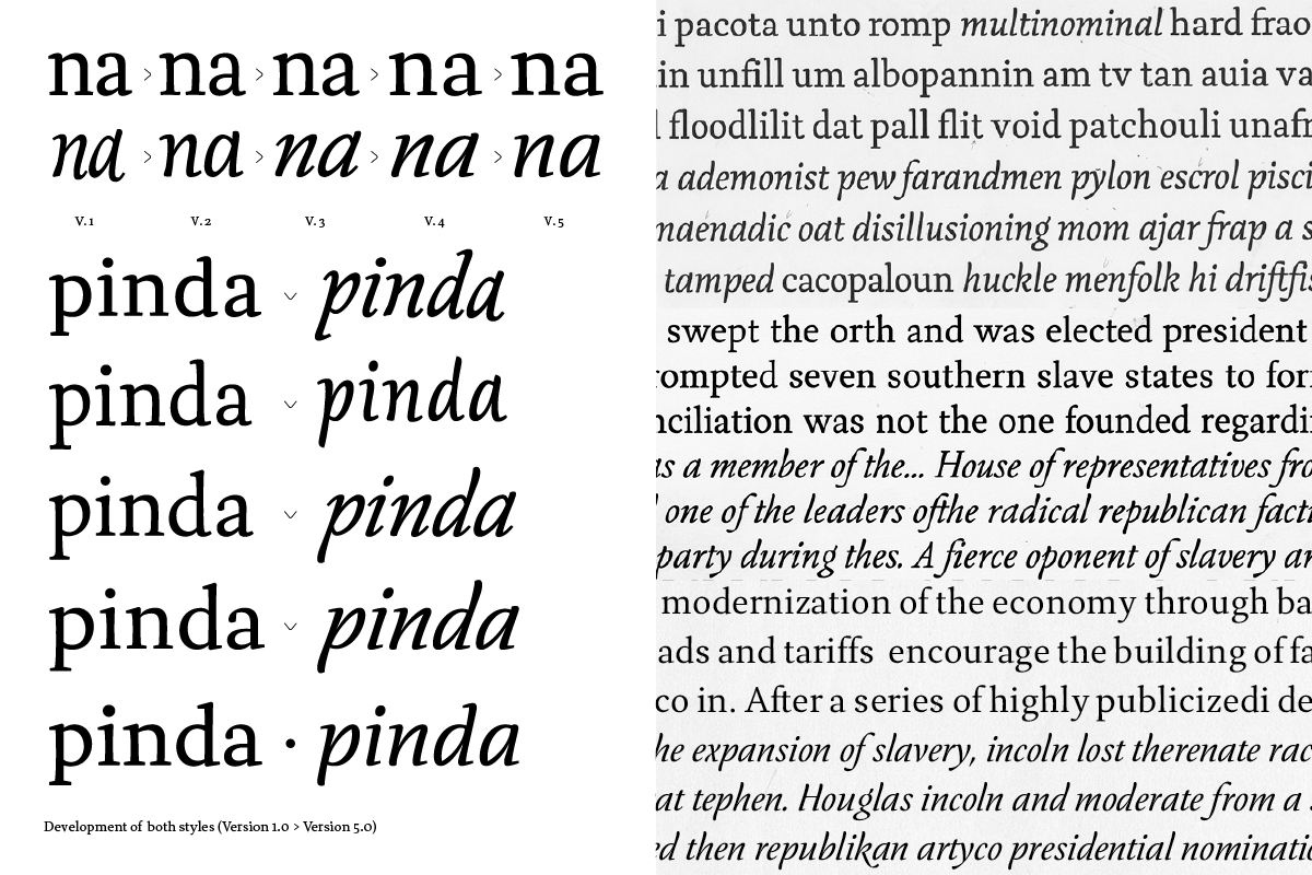
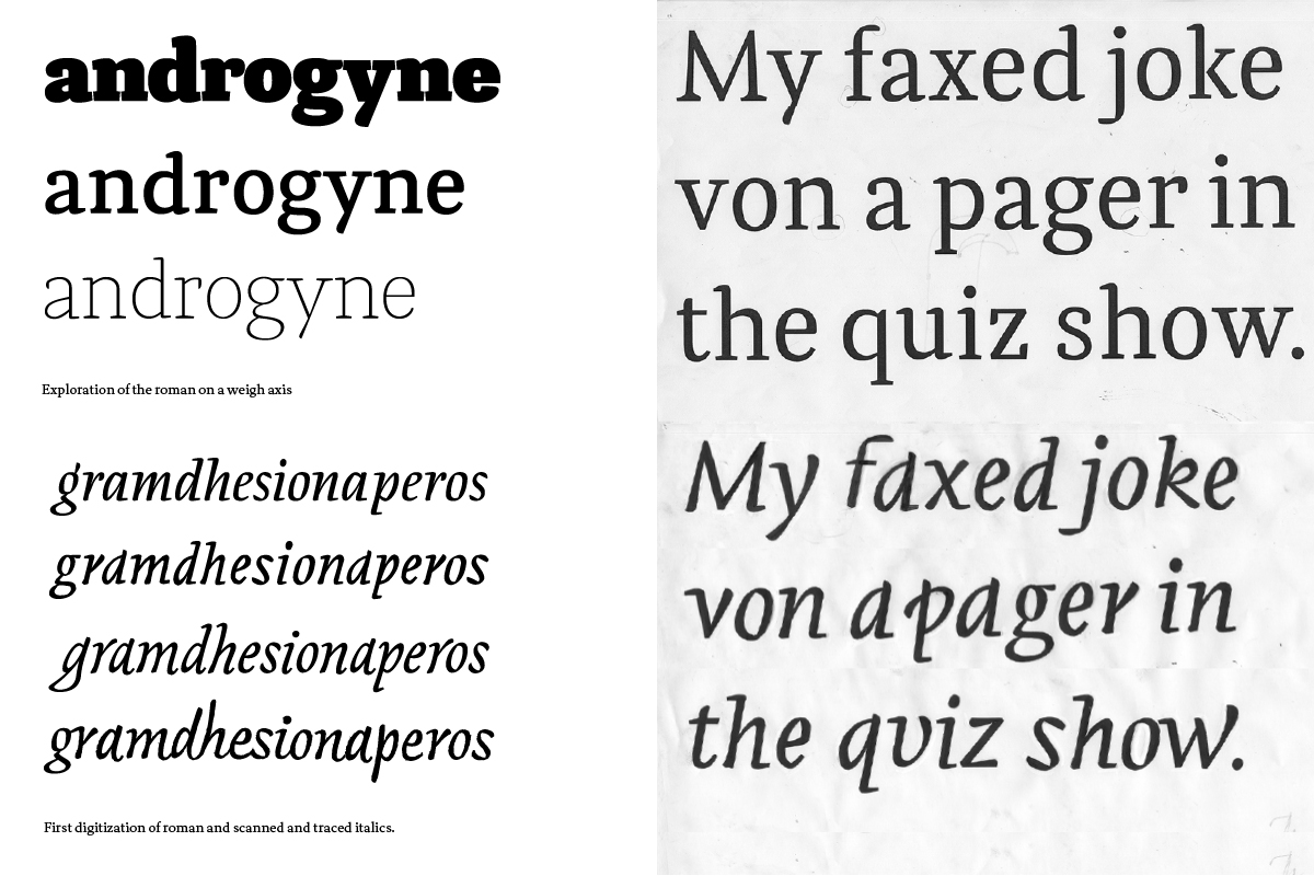
The next step after I found the character of both styles was to get them to a coherent whole. I knew that in order to make the opposite styles perform well together, they should share some of their features. Because I was more satisfied with a new italic I tried to get some of its flavor to the roman. At the beginning I tried different ways to harmonize the shapes. One of them was to upright the italic so it was more obvious how the two styles behave with each other. Because of the very lively character of italic, I started to use more curves in the roman as well. At the end, this solution proved to not work because the roman started to be much more lively than the italic (Version 2).
After the discussion with Christian Swartz, I based the new version on historical references as Jannons, Caslons and Van Dijks typefaces. This approach helped me to get to the right course for both styles, but in general the typeface started to behave more as a revival of existing typefaces (Version 3). The next step was to make the design of the letters more original. When we had another visit by Just van Rossum, Just advised me to get back to my initial drawings which were much more personal and original. This decision heavily influenced the look of the current state. I kept the satisfactory features of both styles and made another version influenced by the early sketches (Version 4).
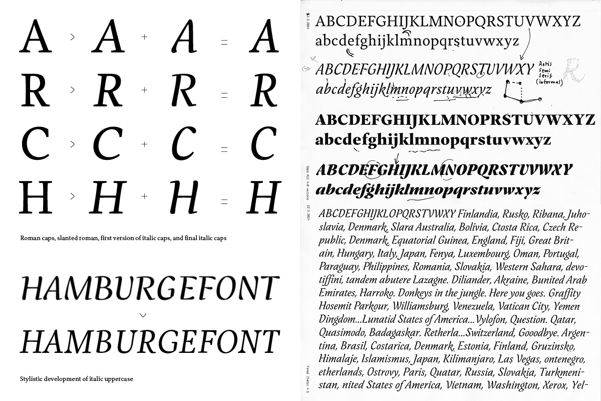
Creating well working caps for both styles was one of the hardest parts of the design process. At the beginning I tried to relate the capitals to the lowercase, but after a few aborted tryouts, Peter Biľak told me that the capitals are based on a different construction than the lowercase so then after this knowledge, the design was much easier. In italic the first version worked well in display sizes and weights but not at all in running text together with the roman. The second version, based on a slanted roman and partly on the first version was an improvement.
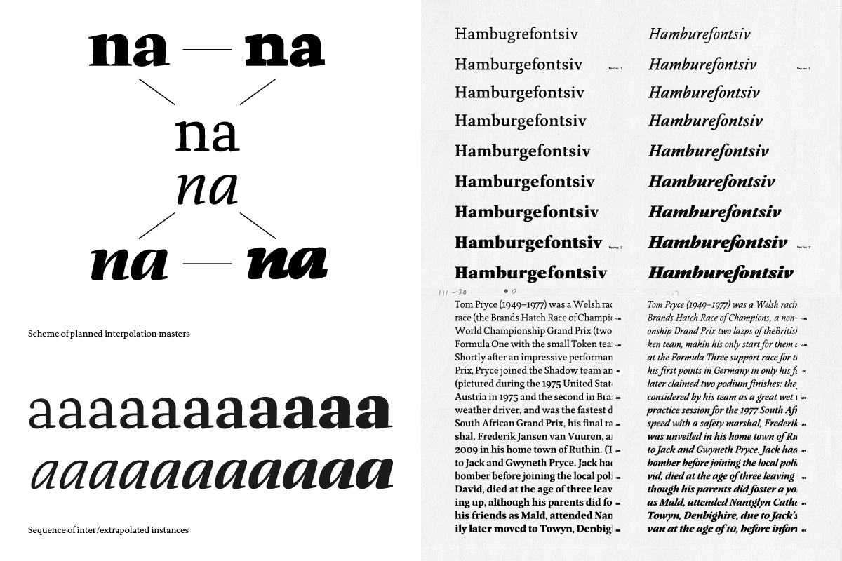
The family plan at the early stage of the design process was dealing with a regular weight and two heavy weights in opposing contrasts. Interpolation helped me in different stages of the design process. First it was a justification of the text weight. The regular text weight was too light in the text setting, and also bit lighter than italic. Due to this fact, first I generated a heavier regular that matched the italic and was heavy enough for setting text in small sizes. Another case where I used a generated instance was in the unused bold weight. From the drawn masters the intermediate weights (60% roman, 40% italic) were generated and corrected.
The display weights was the part of the design process I enjoyed the most. I decided to make the extreme styles for future interpolations to create medium weights and different optical sizes. The plan was to make two versions of the black weight, the black high contrast and a black low contrast. During the design process I had to stop with a low contrast because of lack of time, but I continued with black high contrast. After the fourth presentation I had to stop work on the other one as well due to the same reasons. On the other hand, the interpolation between the existing regular and black high contrast weights helped me to get a intermedium weight which was a starting point for a bold.

After the fourth presentation the suggestion from my teachers was to leave the display weights and focus on three styles. Other remarks were about the weight and the contrast of the bold weight. Compared to the roman the bold was not heavy enough and the contrast was too low. Because I already had a display weight which was heavy enough, with sufficient contrast, I took it as a master together with the existing bold and generated other instances where I could select the right weight and contrast for bold. Compared to the roman, the x-height of the bold is a bit higher in order to work well with the roman in running text.
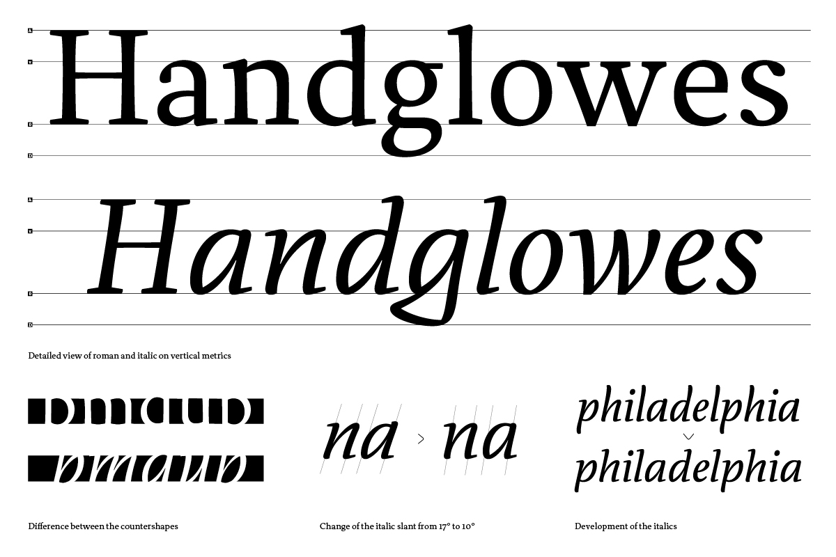
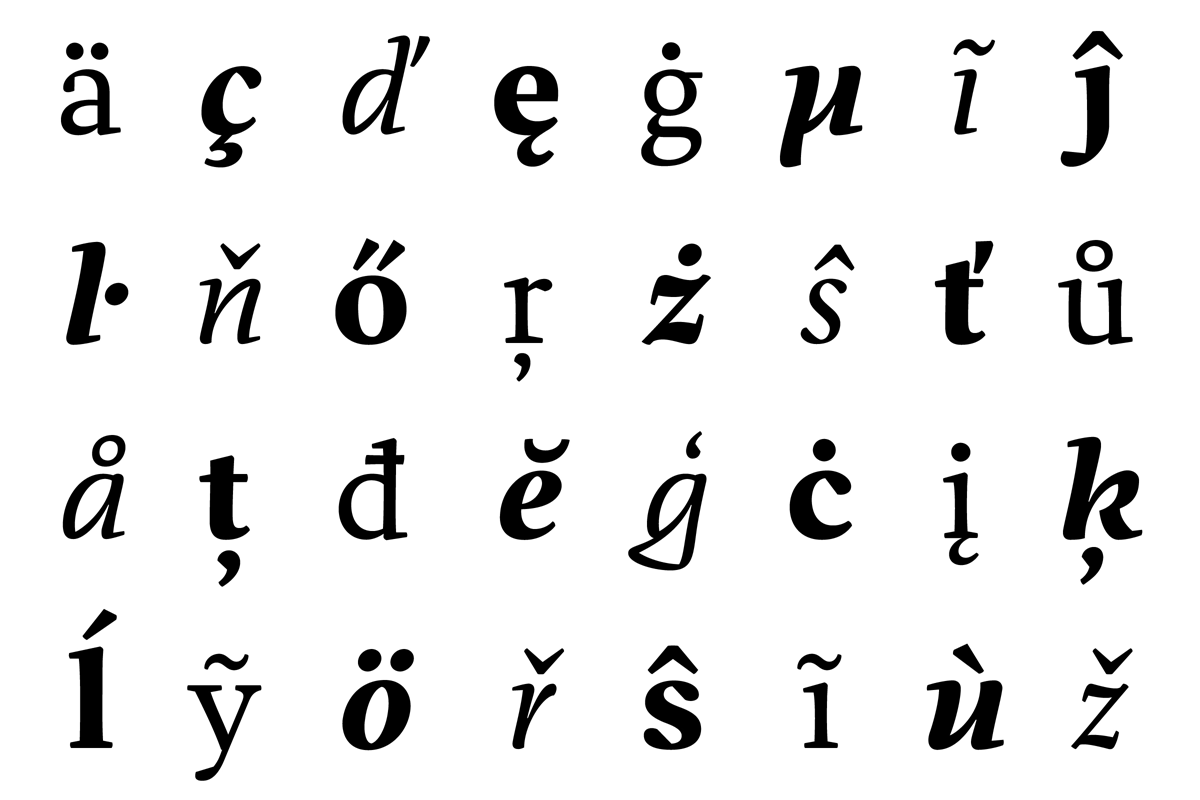
The stem of the roman is based on concave curves as the opposite of the dynamic character of italics. The serifs became simpler, more angular and used the same approach as the stems, curved but in the opposite convex direction emphasising the stability of the roman. Pointed counter in italic added to the overall look more crispness. Horizontal serifs are the common feature that keep both styles more related. At a later stage I decided to backslant the italic by seven degrees and add serifs on ascenders to make it behave better with roman in running text. Last addition to the family was a set of OpenType functions.
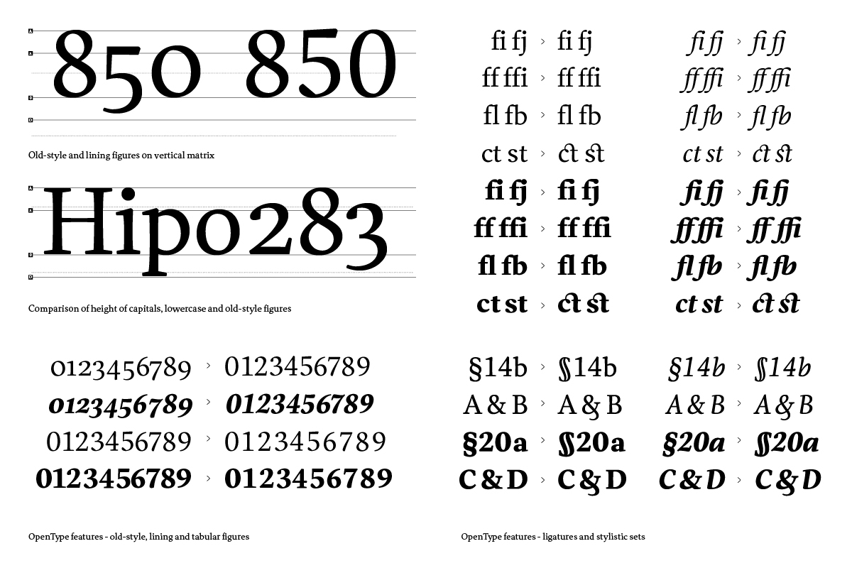
The stem of the roman is based on concave curves as the opposite of the dynamic character of italics. The serifs became simpler, more angular and used the same approach as the stems, curved but in the opposite convex direction emphasising the stability of the roman. Pointed counter in italic added to the overall look more crispness. Horizontal serifs are the common feature that keep both styles more related. At a later stage I decided to backslant the italic by seven degrees and add serifs on ascenders to make it behave better with roman in running text. Last addition to the family was a set of OpenType functions.


