You are using an outdated browser. Please upgrade your browser to improve your experience.
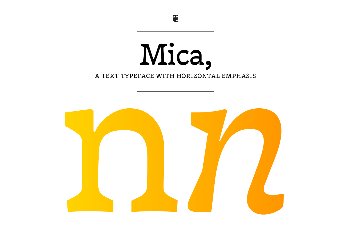
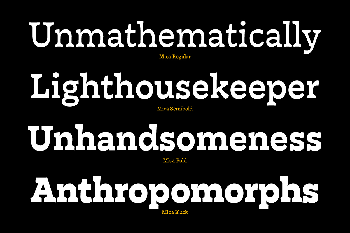
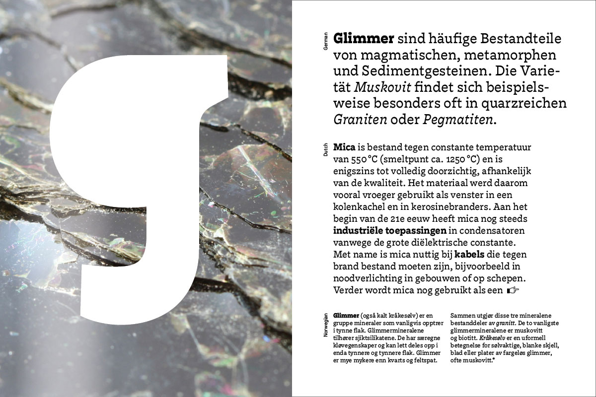
Mica
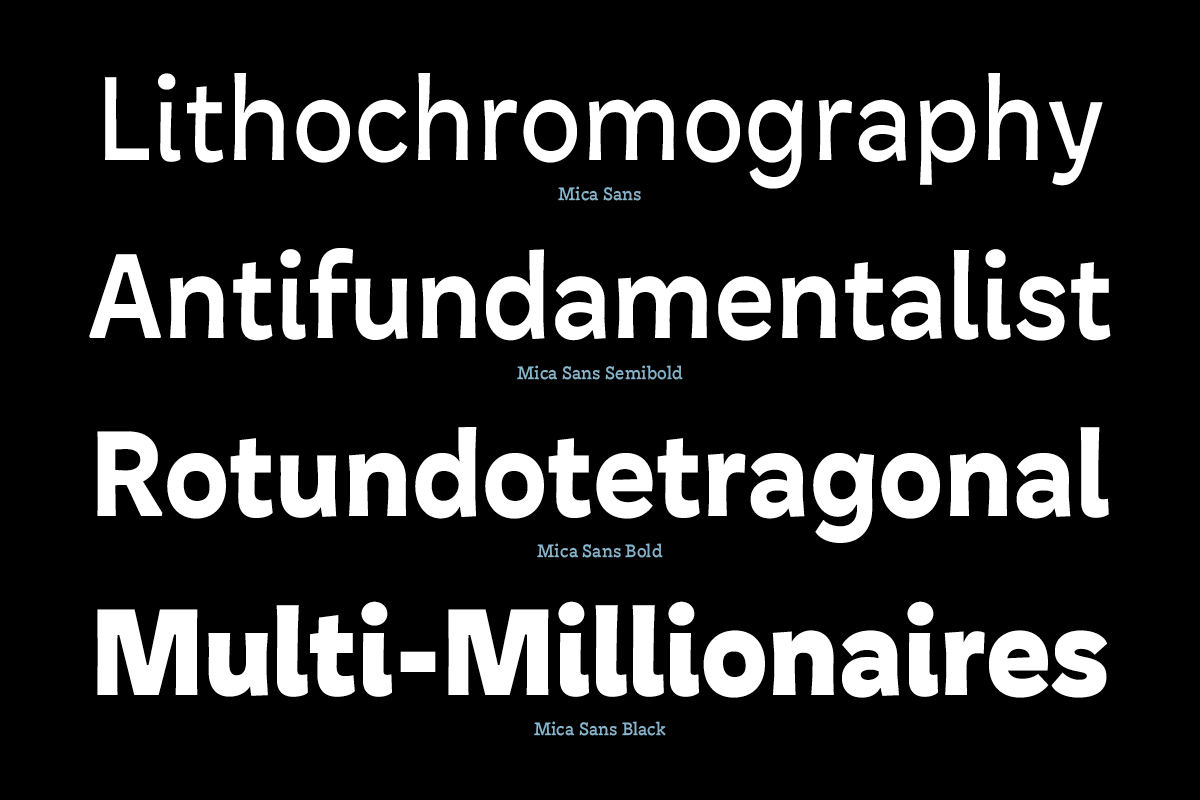
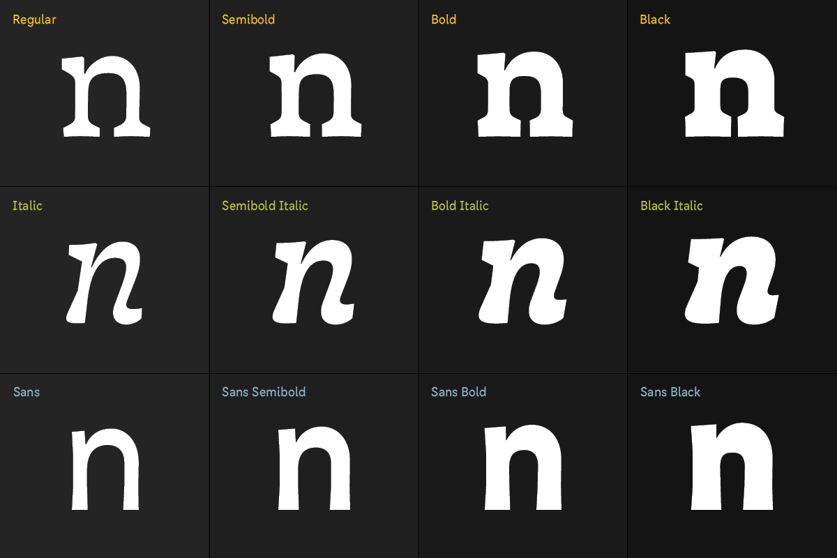
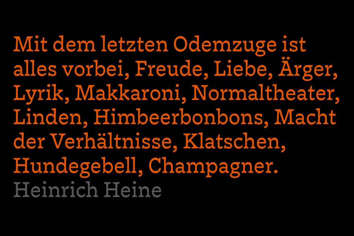
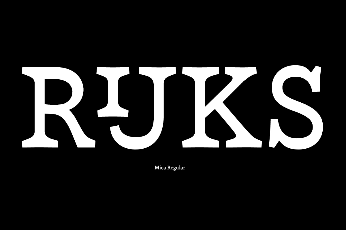
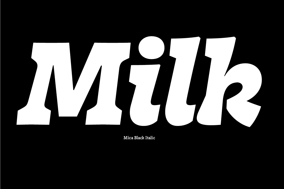
Latin type generally has thicker verticals than horizontals. But what if it doesn’t? – Exploring the subtler sides of reversed-stress typeface design beyond common clichés of cartoons and cowboys, Mica is a serif typeface suitable for text whose horizontals are slightly thicker than its verticals. This lends it a unique voice and texture, causing lines of text to strongly band together. Mica aims to be distinctive, lively, versatile and somewhat inconspicuous. The family contains romans and italics in four weights, along with a proposal for a companion sans.
Switzerland
Nina Stössinger
Nina Stössinger (1978) discovered her love of type while studying multimedia design at Burg Giebichenstein HKD Halle (Germany). After graduating, she freelanced as a graphic and web designer with a growing focus on typography and book design. A postgradual type design course at ZHdK Zurich led to her first published typeface – FF Ernestine – but it was not enough to scratch the itch: Besides selecting and setting type (and occasionally writing and speaking about it), Nina most of all wants to make type; so she happily left her studio to delve deeper into the craft at TypeMedia.
process
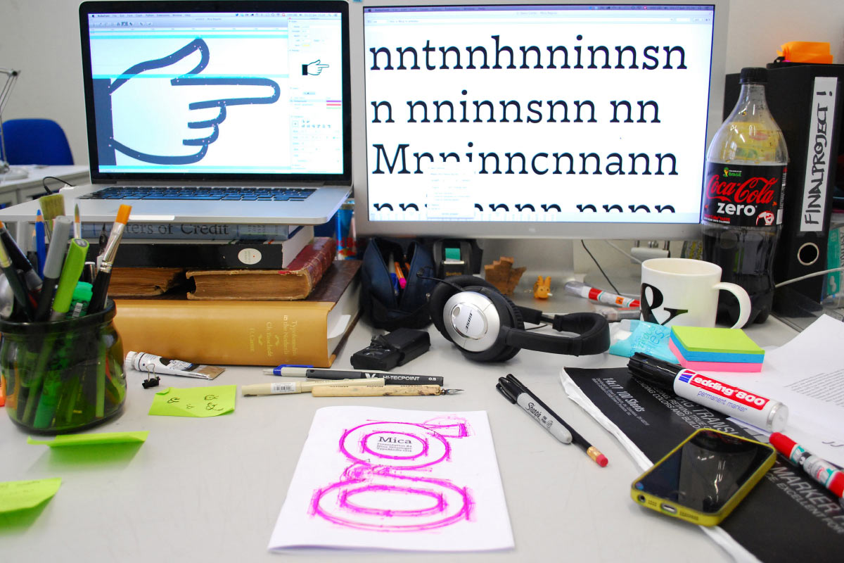
I strove to combine different (analog and digital) tools in the design process, choosing the one (or more) that seemed most fitting for each task. This was fairly new for me – I had previously worked almost exclusively digitally. The resulting process was intense and sometimes messy, but ultimately quite gratifying as it opened up a wider spectrum of options and ideas.
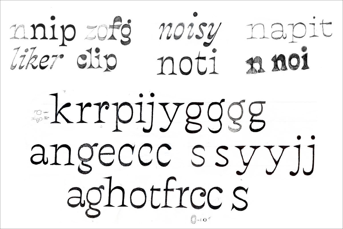
Early sketches for the Roman. These helped clarify some of the directions but also had recurring problems; at this point, they were generally too light, and most of them seemed too cold and spiky.
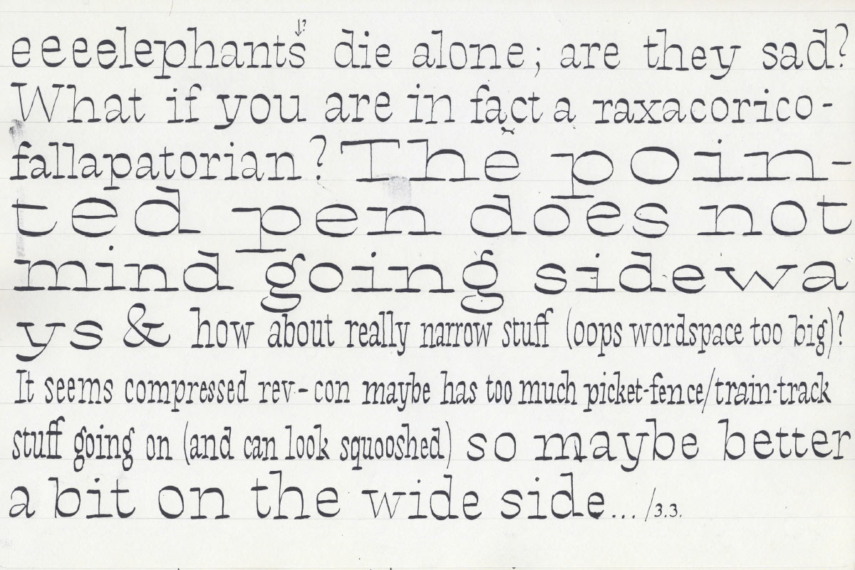
Writing practice, using a pointed pen held at roughly 90 degrees, turned out to be surprisingly helpful. It was useful for quickly trying out different structures; and on a more detailed level, the pen introduced interesting idiosyncrasies, some of which I adopted in my drawings – for instance the not-quite-consistent stress angle. This approach helped make the design less mechanic and stiff.
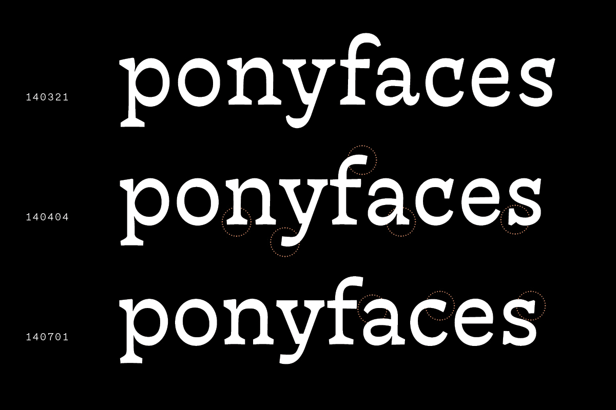
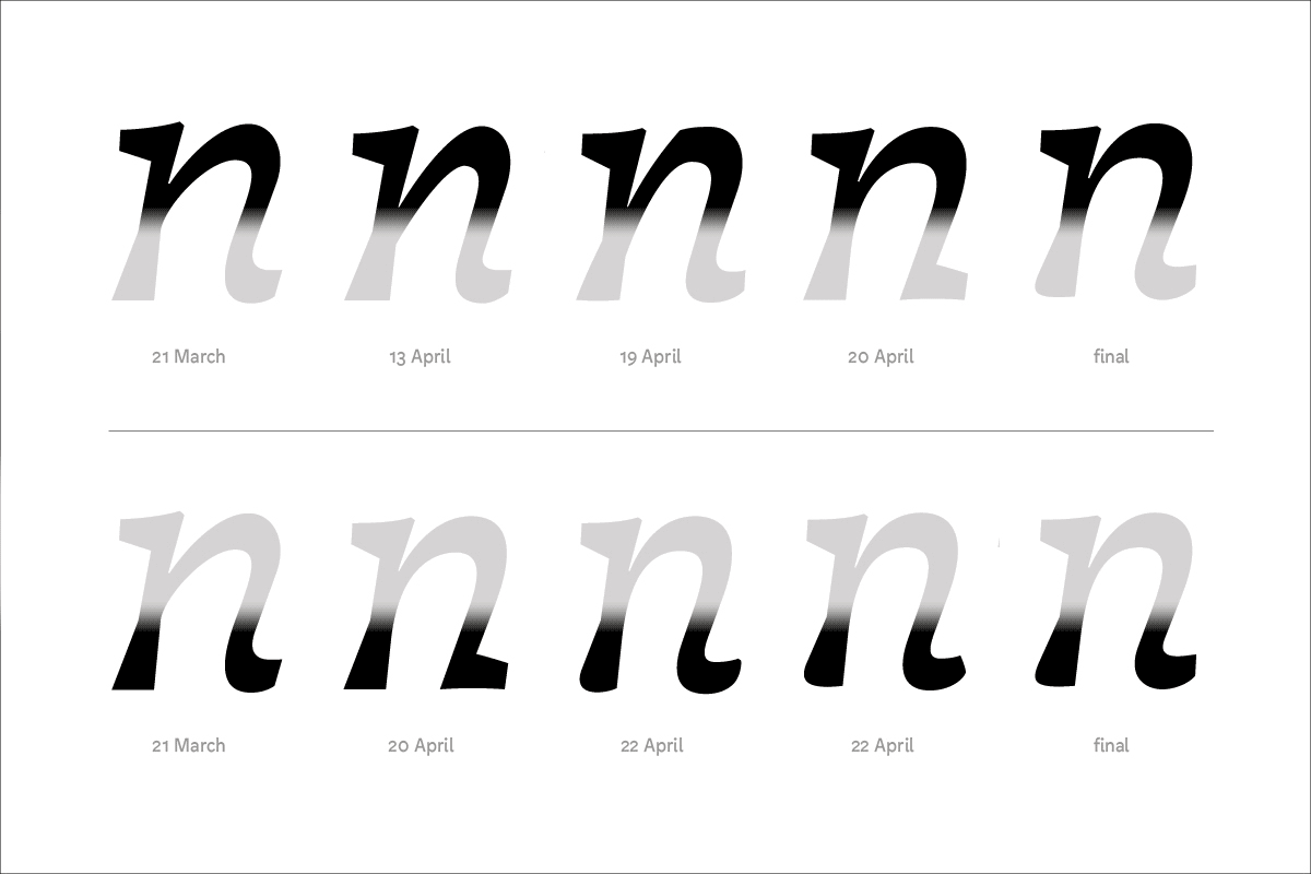
The digital drawings saw a multitude of revisions, tweaks, and iterations between early March and early July; the evolution is shown here in an example word.
I was anxious not to let the design become stiff or boring, which resulted in early versions trying too hard to be interesting and cute – which was at odds with my aims of making a relatively unobtrusive text face. Much of the process thus focused on eliminating distractions, and stabilizing the design and its horizontal emphasis.
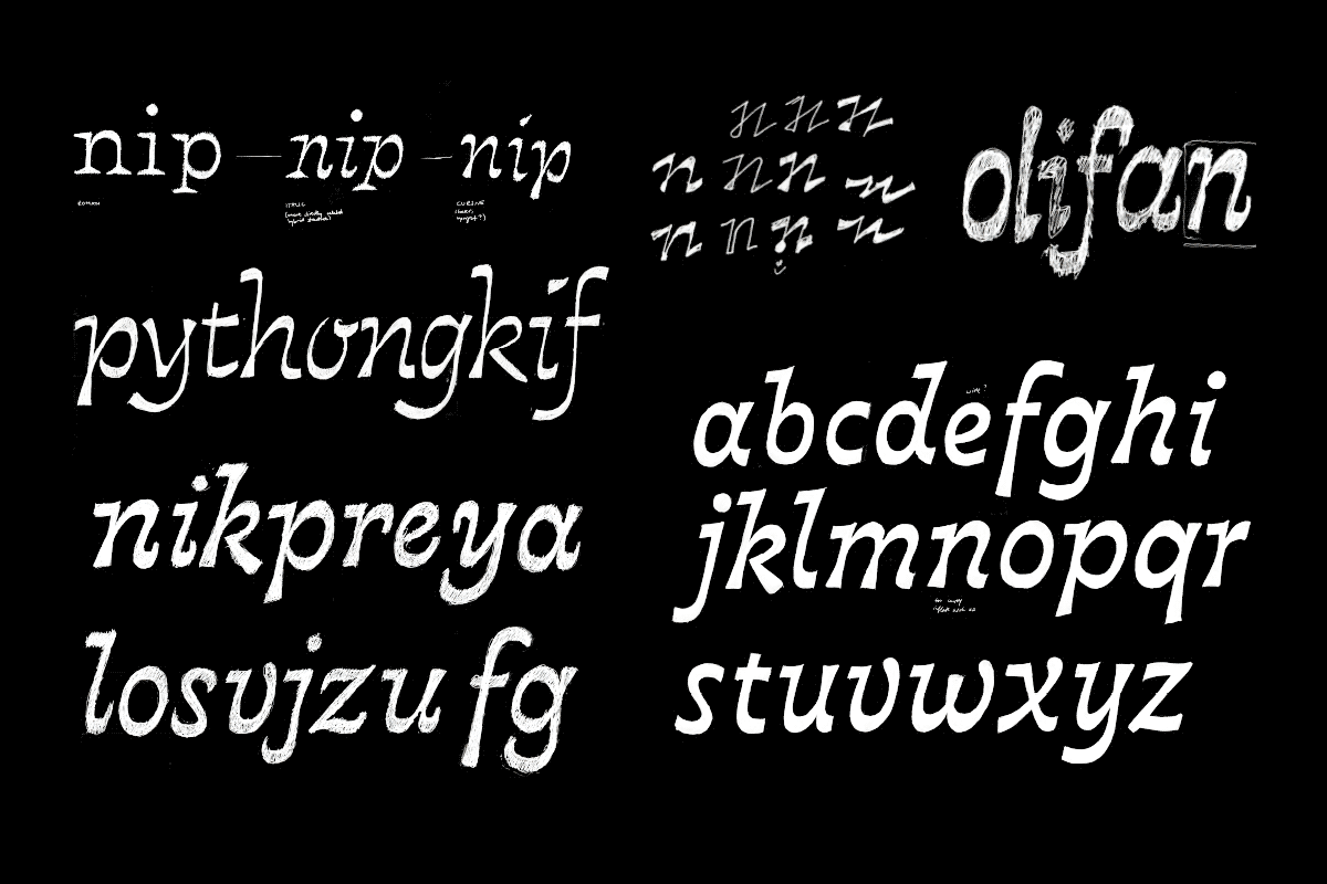
Various sketches for the italic (roughly chronological from top-left to bottom-right), which was drawn in parallel to the roman. Again taking inspiration from writing practice, I opted for a cursive forms that allowed me to explore structures quite distinct from the roman.
The italic seemed easier than the roman to get roughly right, but then it took a lot of time to figure out the exact shaping of its various elements. One example are the upstrokes and the outstrokes in the arch shapes, for which I tried a multitude of different solutions.
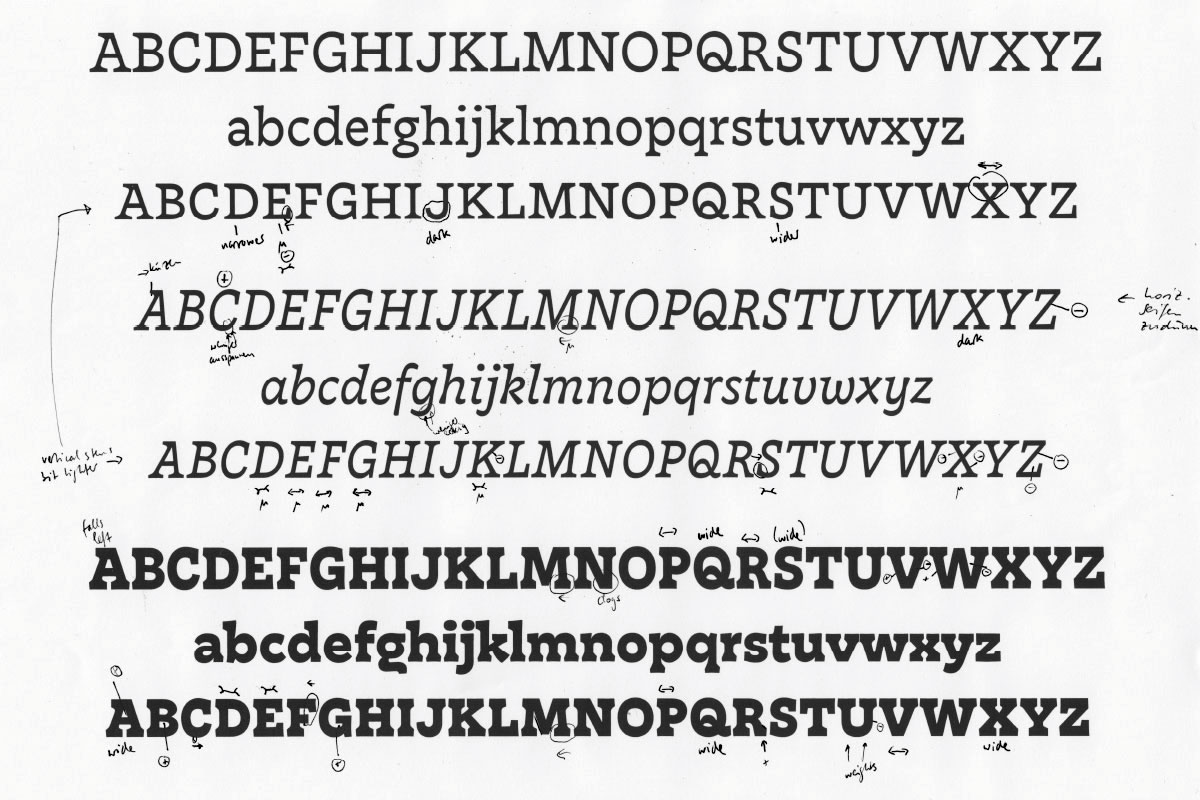
The whole drawing process was very much an iterative one, dominated by testing, squinting, and correcting. This sheet of corrections shows that I drew two sets of (extremely-sized) capitals for the three main styles, between which I interpolated to pinpoint the right cap size. In this way, interpolation was used throughout the design process to take some of the guesswork out of it.
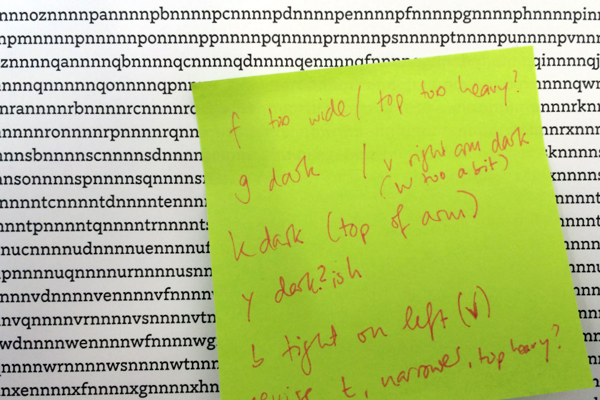
Especially towards the end of the process most of my time was spent staring at letters in context, identifying and fixing disturbances in the rhythm - regarding kerning, spacing or the drawing itself.


