Type and Media

TypeMedia is a full-time one year Master program held at The Royal Academy of Art, The Hague in The Netherlands, that gives participants the possibility of delving deeper in the field of type design. At TypeMedia, students work intensively in small groups of no more than twelve persons. They work under the guidance of expert and enthusiastic teachers from the permanent and visiting faculty. Although the student’s personal motivation is given primary place, collaboration with other students is of fundamental importance.

This year's graduates came from a variety of countries:

Alexandre Saumier Demers from Canada, Hugo Marucco from France, Mark Frömberg from Germany, Mark Yehan De Winne from Singapore, Sláva Jevčinová and David Chmela from Slovakia, Nina Stössinger from Switzerland and James T. Edmondson from the United States of America.

The course also had past graduates from many more countries, of which Argentina, Australia, Austria, Belgium, Bulgaria, Brazil, Colombia, Croatia, Denmark, Estonia, Finland, Hungary, Iceland, India, Israel, Italy, Japan, Latvia, Lebanon, Lithuania, Malaysia, Mexico, New Zealand, Norway, Paraguay, Poland, Portugal, Romania, Russia, Scotland, South Korea, Spain, Sweden, Taiwan, the Netherlands and Turkey.

With the help, assistance and supervision of the regular faculty teachers, visiting teachers and lecturers, the TypeMedia students immerse themselves in the type design world by completing many different assignments. These assignments range from stone carving classes, Python programming, the creation of revivals of lead typefaces, calligraphy exercises, exploration of different sketching techniques, all of which are constantly reviewed and discussed. On top of that, the students go on regular field trips around the country and abroad to explore the typographic, artistic and architectural culture of the region and attend many different conferences and lectures by numerous international type design experts. All this experience is used in the student's final projects, four months spent entirely on the creation of an original typeface family.

Acknowledgements

This year's students would like to thank the regular teachers, visiting teachers and supervisors at TypeMedia for their incredible help, support and commitment:

Françoise Berserik, Peter Biľak, Erik van Blokland, Petr van Blokland, Frank Blokland, Paul van der Laan, Just van Rossum, Jan Willem Stas and Peter Verheul.

The guest critics and instructors who graciously gave us their time:

Jo De Baerdemaeker, Frederik Berlaen, Liz Bijl, Frank Grießhammer, Luc(as) de Groot, Akira Kobayashi, Kristyan Sarkis, Christian Schwartz.

And finally, a non-exhaustive list of others who have enriched us this year:

Donald Beekman, Frederic Brodbeck, Liza Enebeis, Guy Hutsebaut, Bas Jacobs, Indra Kupferschmid, Warren Lee, Tal Leming, Mathieu Lommen, Hilario Nicolaas, David Jonathan Ross, Georg Seifert, Rickey Tax, Mr. Veenstra, Johan de Zoete.

About

Website developed by Frederic Brodbeck with Flask. Text set in Neutral designed by Kai Bernau and distributed by Typotheque.

TypeMedia 2014

You are using an outdated browser. Please upgrade your browser to improve your experience.


Covik

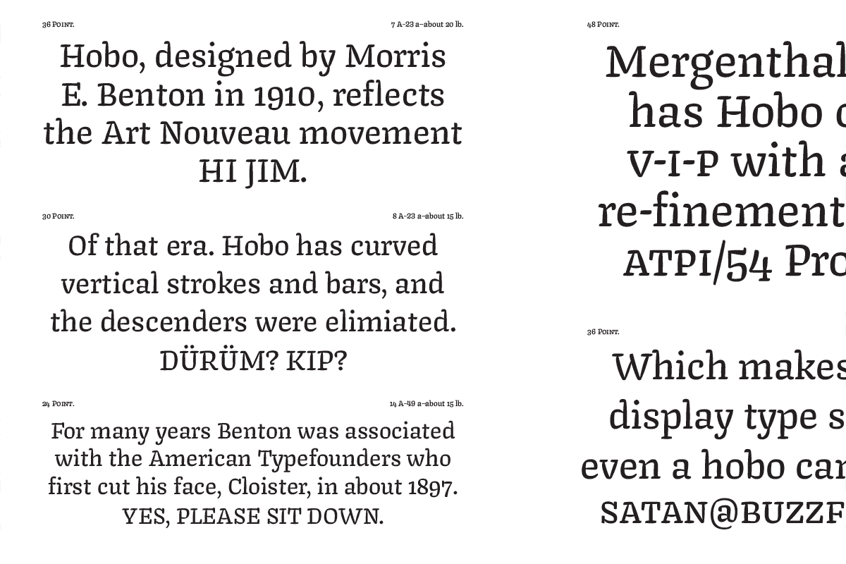
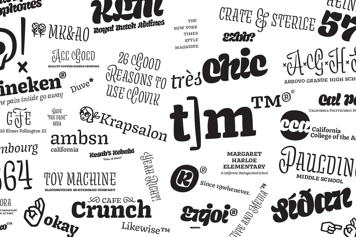
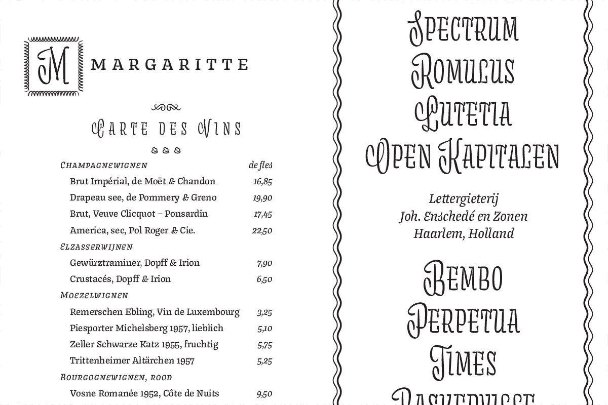
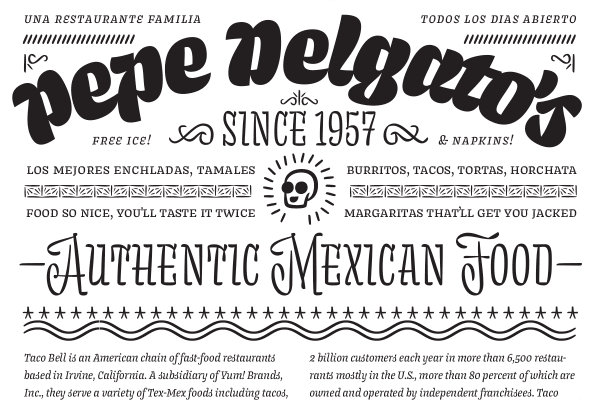
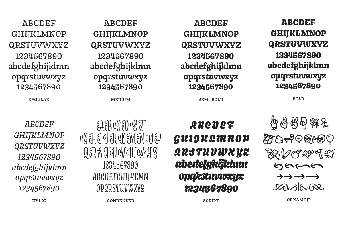
Covik was designed with the goal of creating a small text family with complimentary display faces which work together to create a rich typographic palette. How divergent could a style be while remaining kindred? In what ways could weight, width, proportion, and construction be played with in order to create a varied family? Potential applications are as manifold as the individual styles therein, so it might be helpful to consider what Covik would not be suitable for: bibles, legal documents, warranties, directions on how to assemble something important, funeral home logos, and websites. Everything else is fair game.

USA
James Edmondson

James Edmondson is a type designer and lettering artist based in San Francisco, California. In 2013 he graduated from California College of the Arts with a BA in graphic design, left San Francisco behind, and moved to The Hague to study under all the incredible teachers at TypeMedia, as well as Peter Verheul.

process

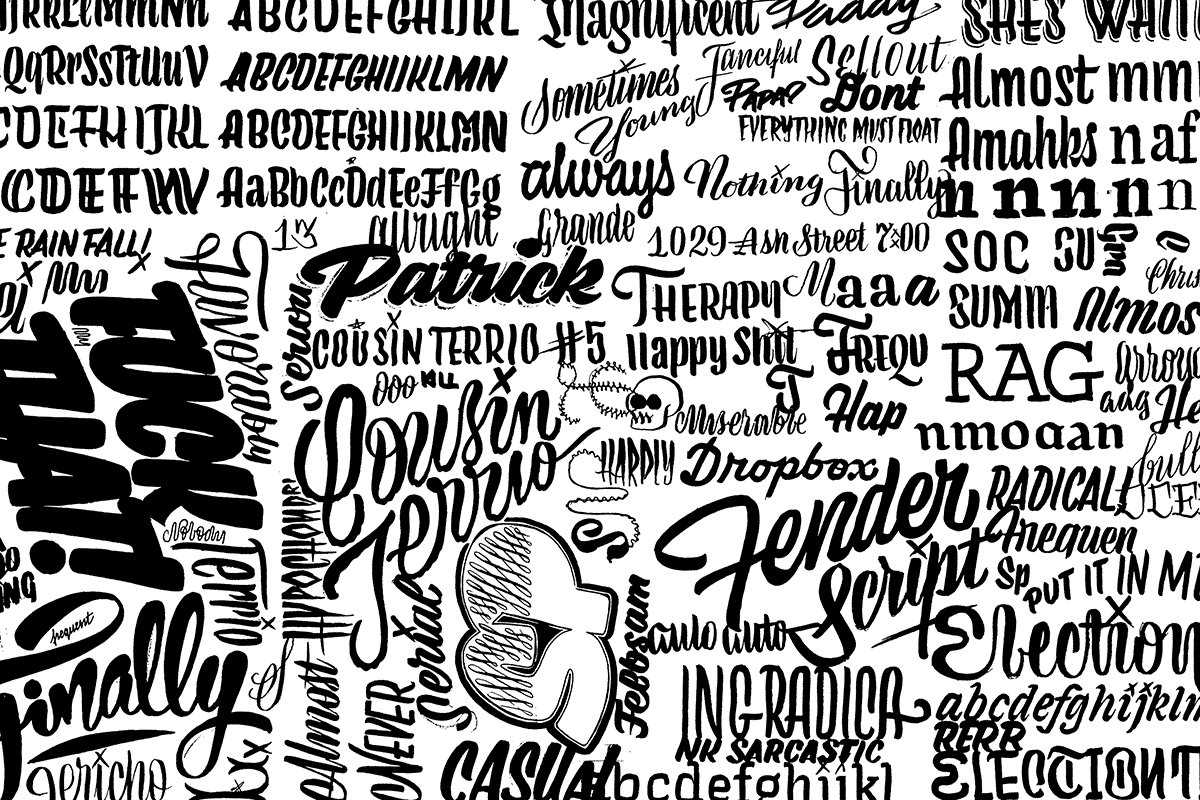
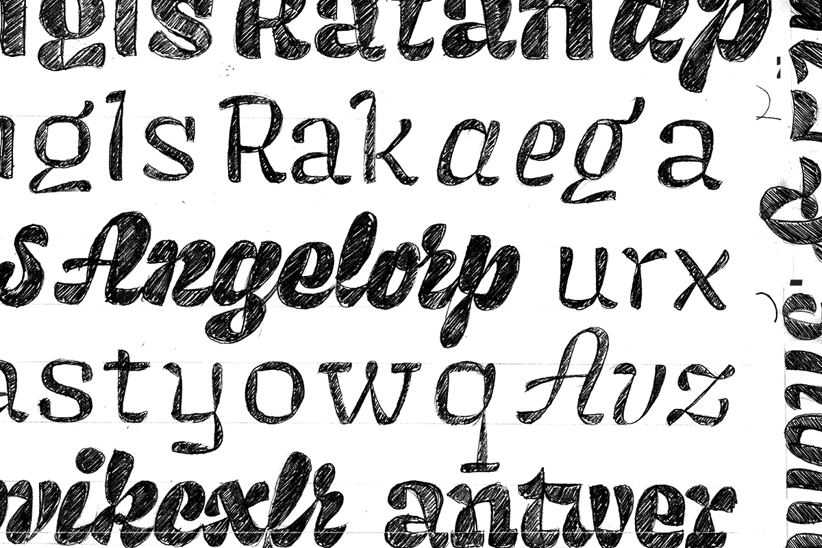
Unlike traditional type families whose members typically vary in weight and/ or width, the goal with this project was to create a robust family of different styles that complimented each other, and could be used for different purposes. To keep the family cohesive, I limited my sketching tools to just the brush pen. These initial doodles explored what the pen naturally wanted to do.

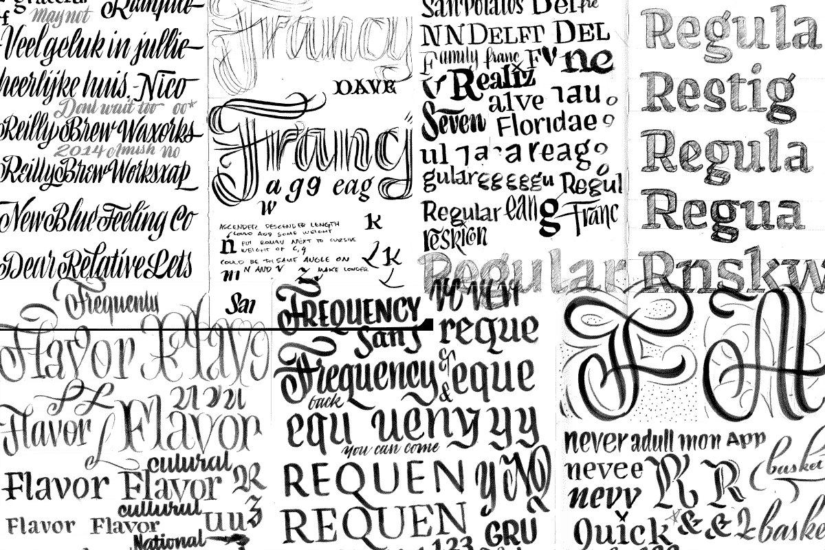
If it was even a little bit interesting, I sketched it. As ideas matured, I refined the sketch with larger pencil drawings.

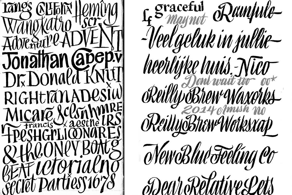
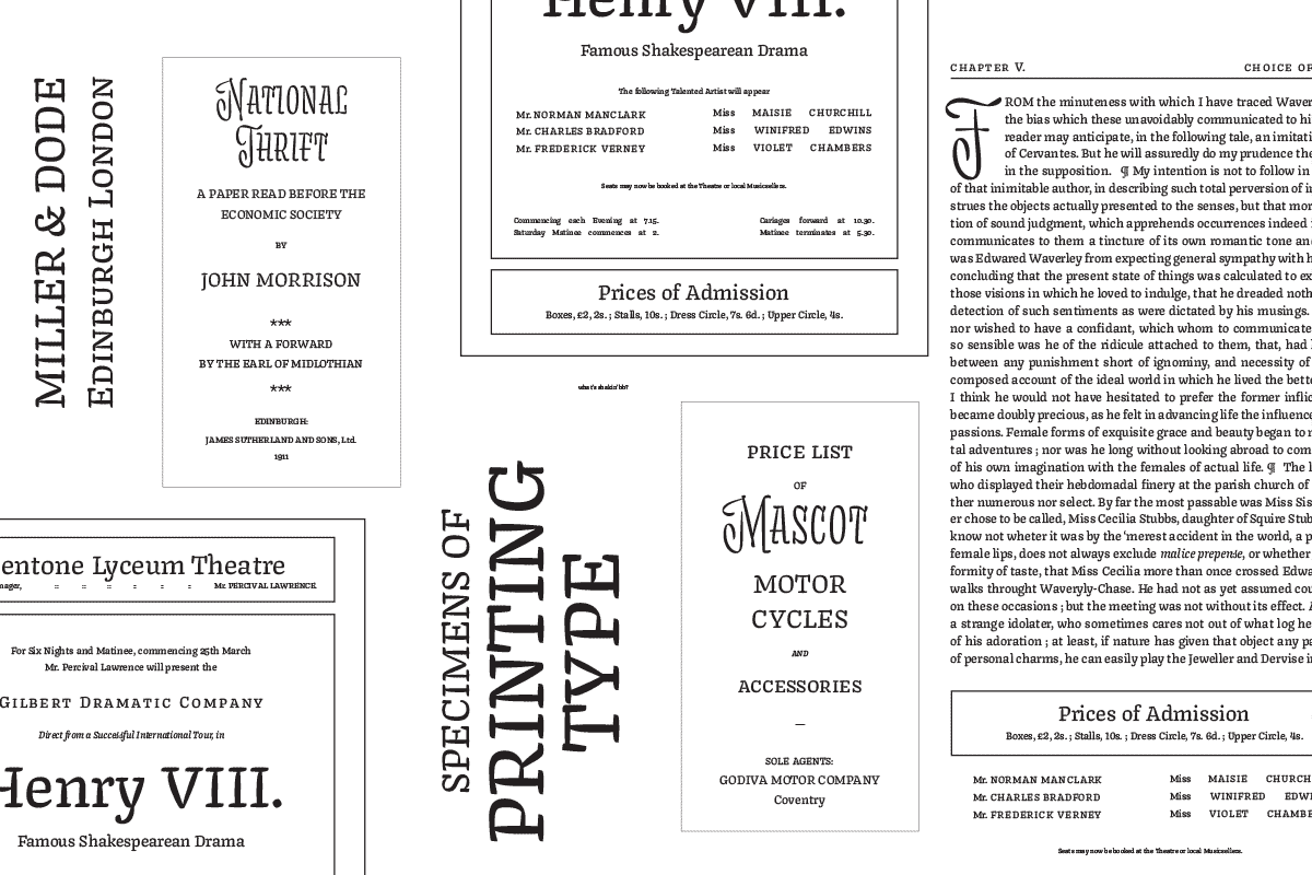
In an effort to mine the past for styles that I could steal from, I explored the work of Hans Tisdall and other mid century lettering artists.

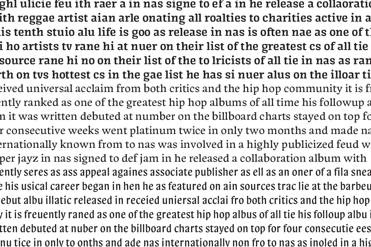
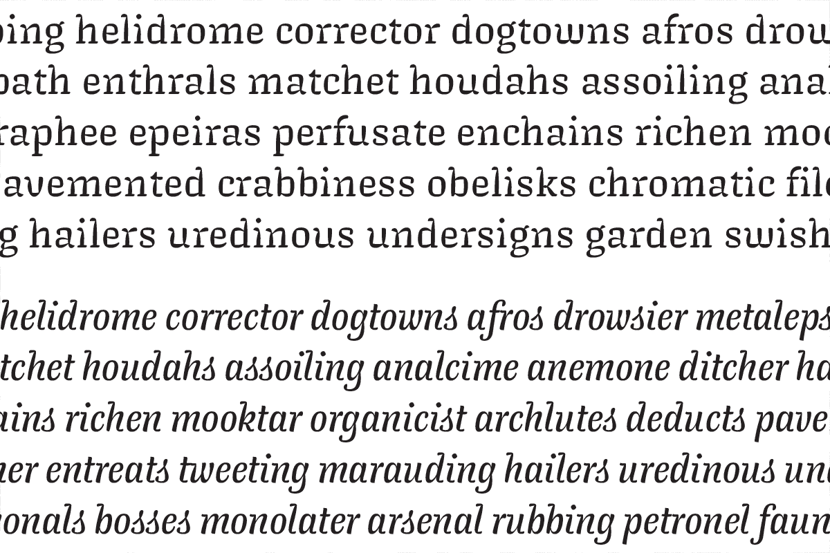
I digitized some of my lettering experiments, and tried to imagine what a whole paragraph might look like in a particular style.

Starting with the text component seemed to make the most sense, and I turned three of my most texty lettering experiments into barebones lowercase fonts.

Long story short, I didn’t like any of them, so it was back to the drawing board.

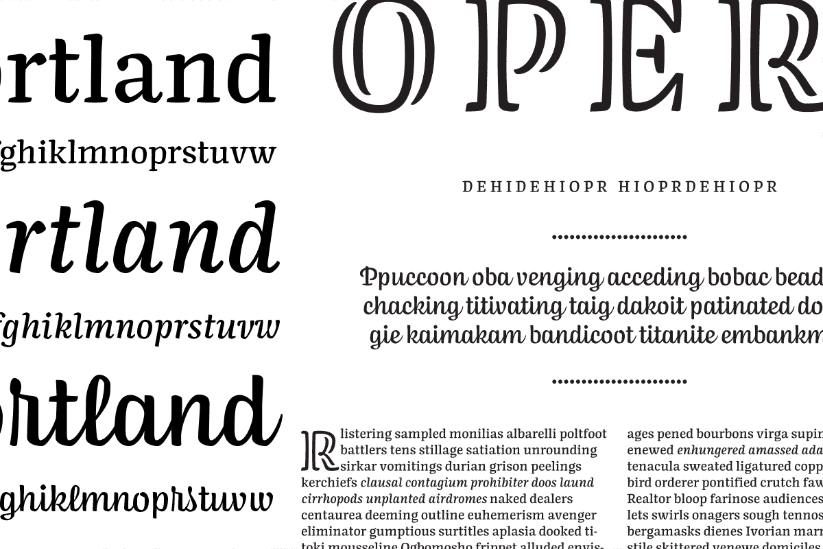
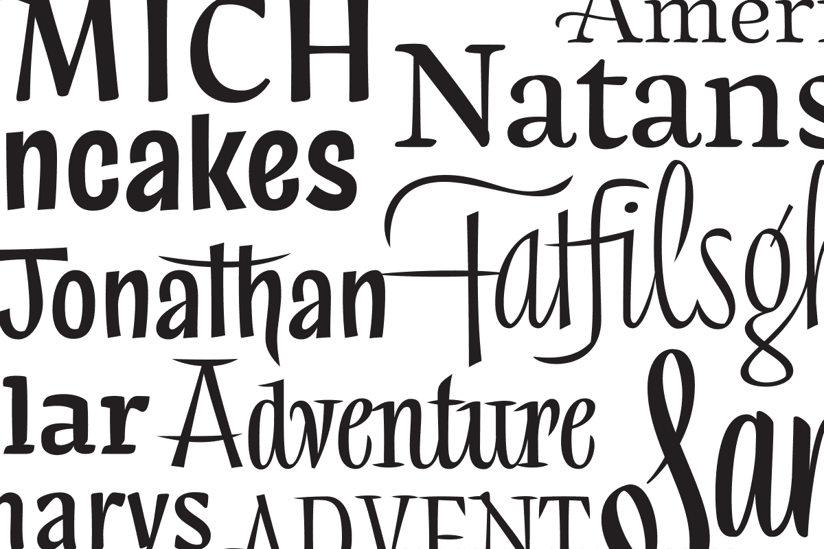
A new family emerged, featuring text and display styles that got along nicely.

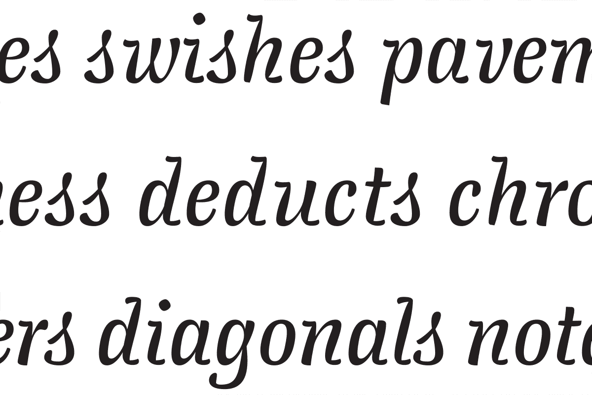
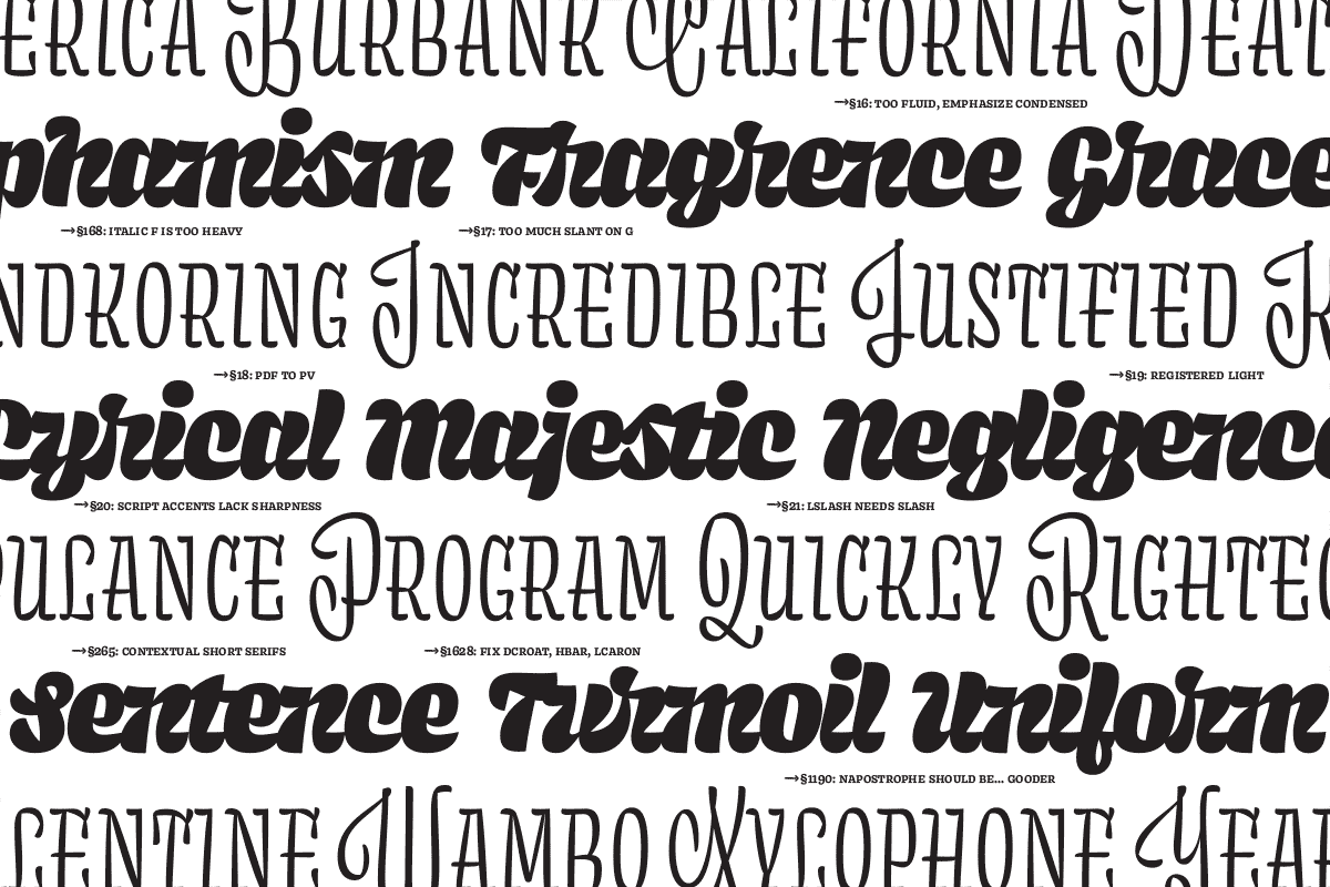
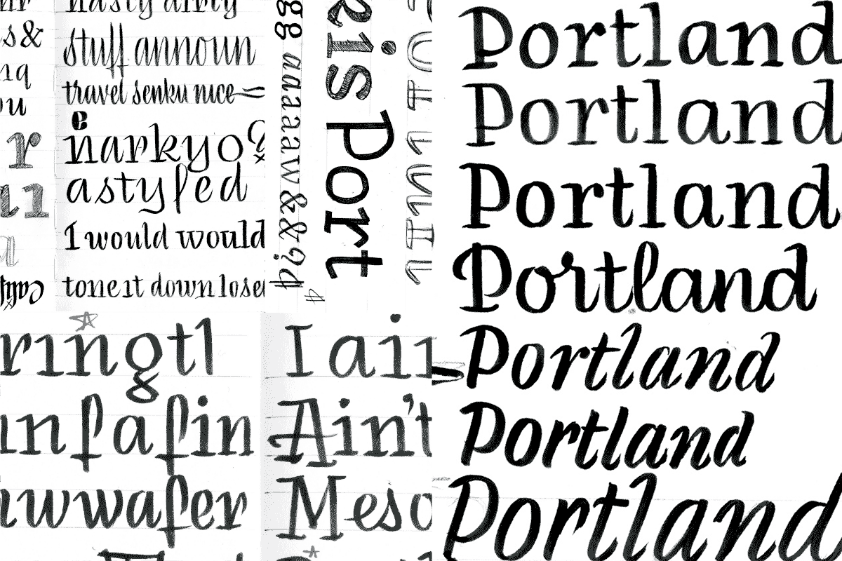
The only problem was that it was boring, and felt like it belonged in a funeral home identity. I was desperate to take the work someplace more interesting, so I played with the italic until something interesting happened. Over many edits, it turned into something a bit more sparkly. The sparkle became the driving force behind most of the design decisions that were to come.

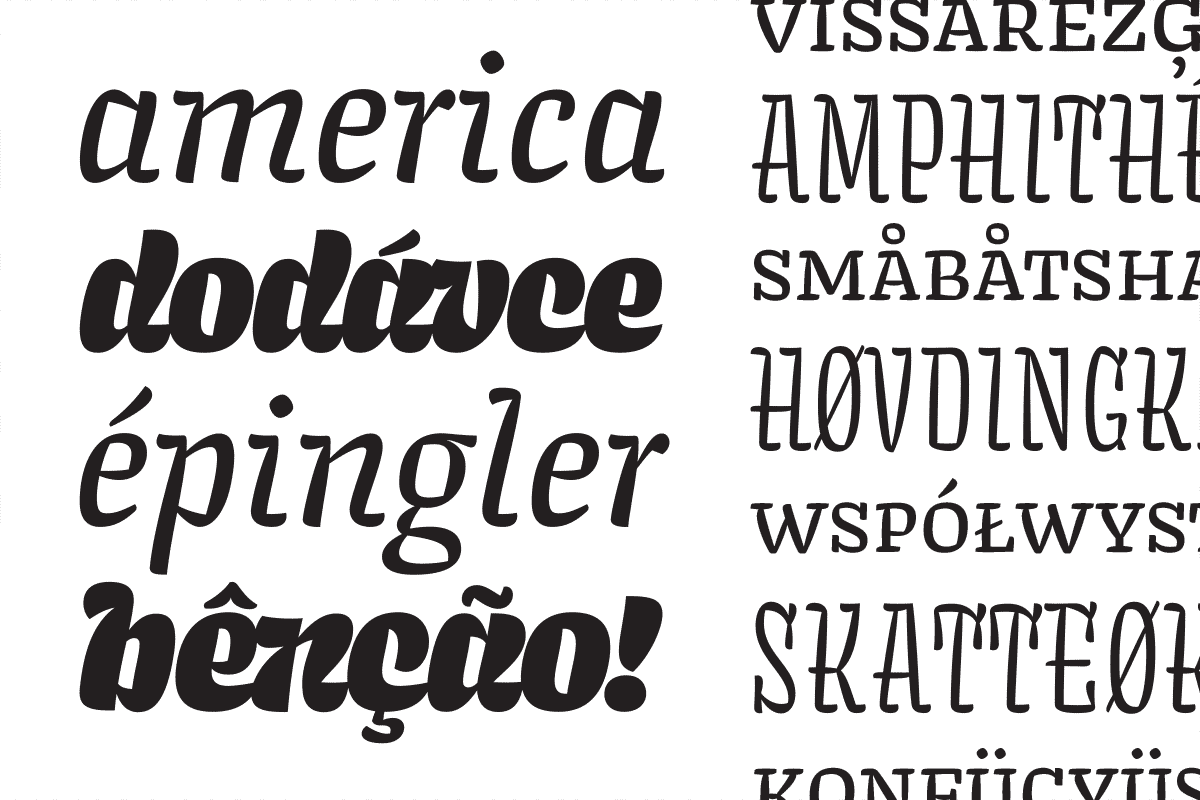
The italic then influenced the two display styles in the family.

In addition to the display styles, the new italic had a big effect on the roman. Here, maybe a bit too much. After this point, it was time to dial it down, make it work at smaller sizes, and give it all the typographic niceties that are useful in a text face. There is more to the story of how this typeface grew up. If you truly are interested to learn more, please get in touch and I can send you an enormous PDF.