
You are using an outdated browser. Please upgrade your browser to improve your experience.
Elisabeth
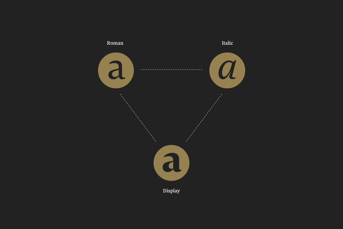
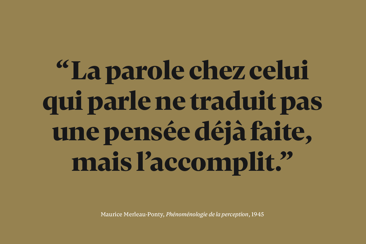
Unobtrusive yet distinctive, Elisabeth is a transitional serif typeface for text and display purpose. The family is composed of three styles: Roman, Italic and Display. Its proportions and contrast work best in reading size while remaining elegant for headlines. Created for print, Elisabeth suits literature books such as novels or poetry and a large range of printed materials.
France
Hugo Marucco
Hugo is a graphic designer and type designer from Annecy, France. He graduated with a BA as a graphic designer from The National School of Fine Arts of Lyon (FR) after studying visual communication in Bellecour School of Arts in Lyon. Before Type and Media he did several internships with Jean-Baptiste Levée and the Atelier Carvalho Bernau.
process

First doodles to find ideas and directions.

My first idea was to work with a pointed pen structure. Early in the process, I decided that the Display will influence the design of the Text styles.
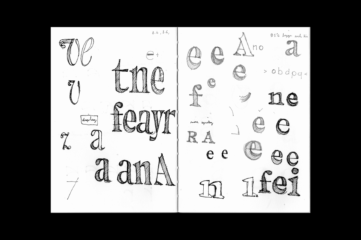
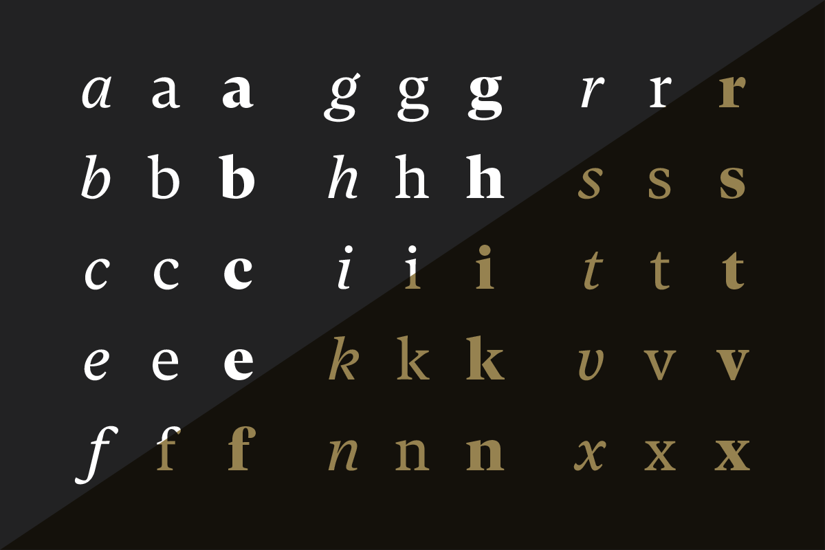
As I was trying to find my design space, I noticed that some features were recurring across my sketches: sharp endings, thin connections, smooth bracketed serifs and ball terminals.
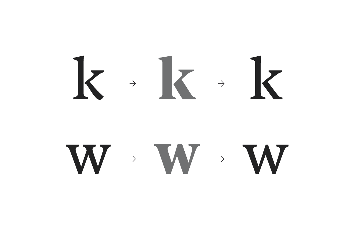
Solutions sometimes came from working on the other styles. Solving problems on the Display (Grey) forced me to reconsider the design of the Roman (Black).
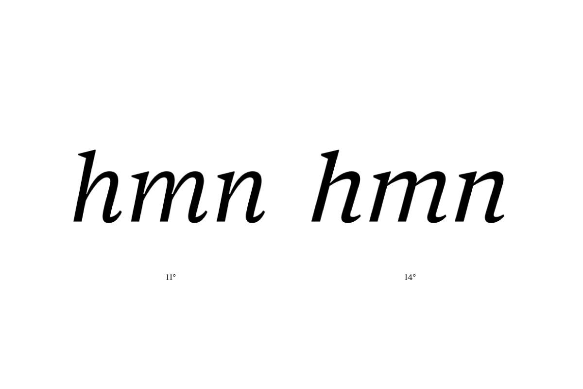
For the Italic, I first started to experiment with different constructions. As a companion to the roman, the italic needed to match its color and contrast, yet I wanted to give it a very singular texture and autonomy. Starting with a slanted roman base, I tried several options to get the right construction. Increasing the slant and getting away from the Roman proportions.
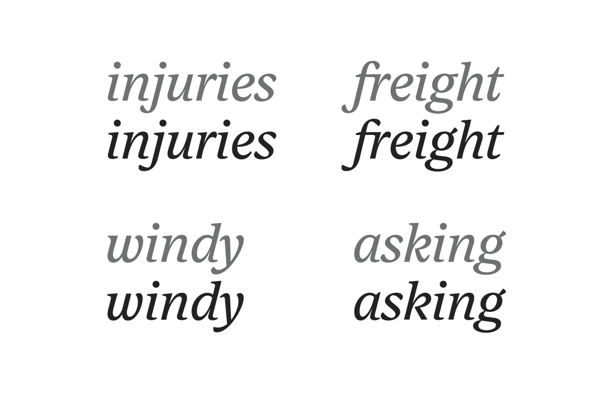
After taking the main decisions about the constructions, I reconsidered the treatment of the terminals and endings. I wanted a balance between sharp endings and smooth connections. To avoid the overall stiffness of the italic, I went for a cursive construction with smooth connections and slightly flared bottom stems.
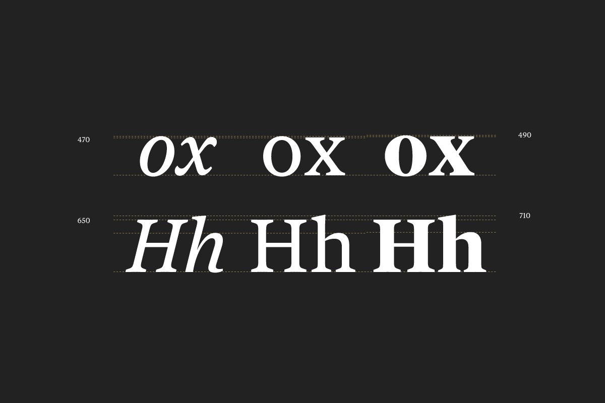
Vertical metrics of the Roman, Italic and Display cuts.
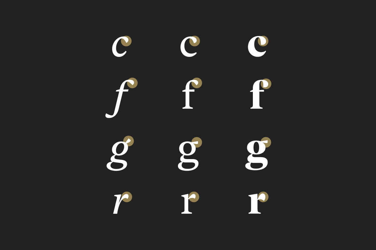
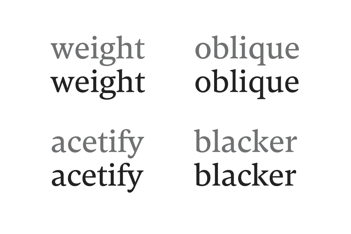
While working on every styles at the same time, I found important to define their similarities and differences. In order to be consistant across the family, I decided to keep the same treatment for the terminals of the Text and Display styles.

Roman & Italic, Roman & Display


