
You are using an outdated browser. Please upgrade your browser to improve your experience.
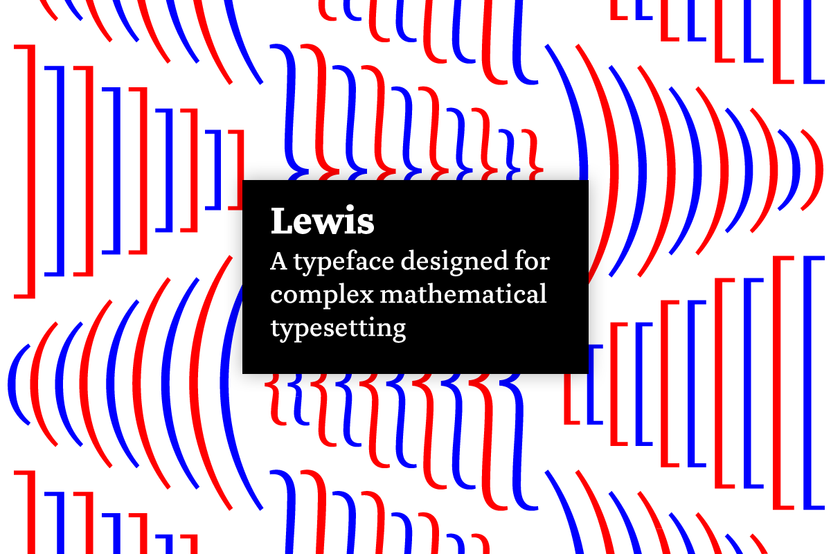
Lewis
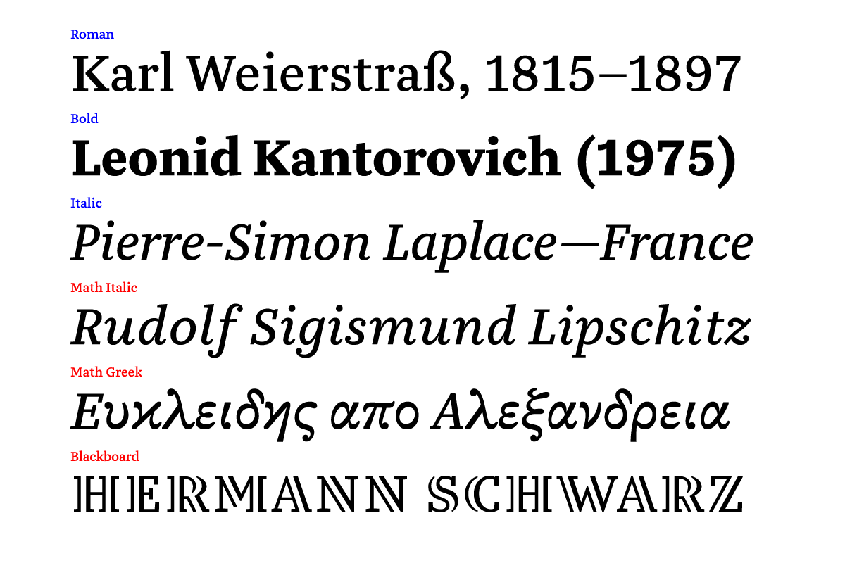
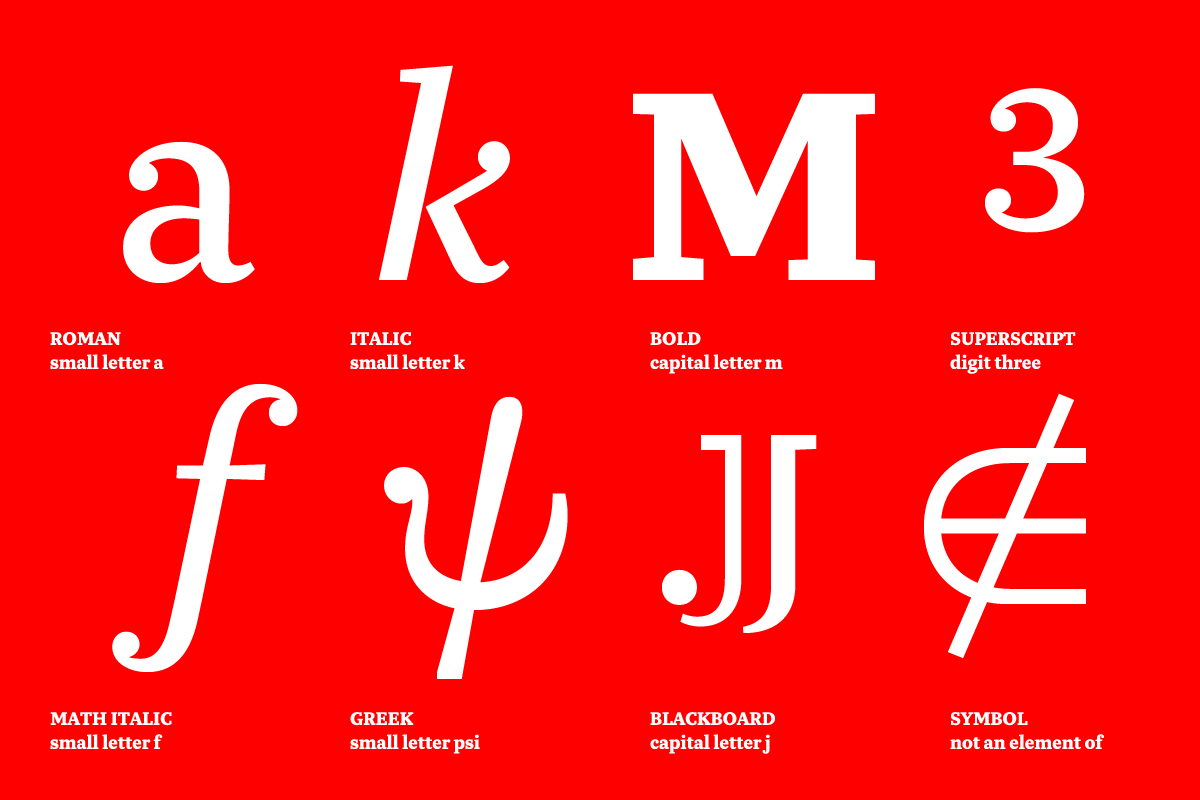
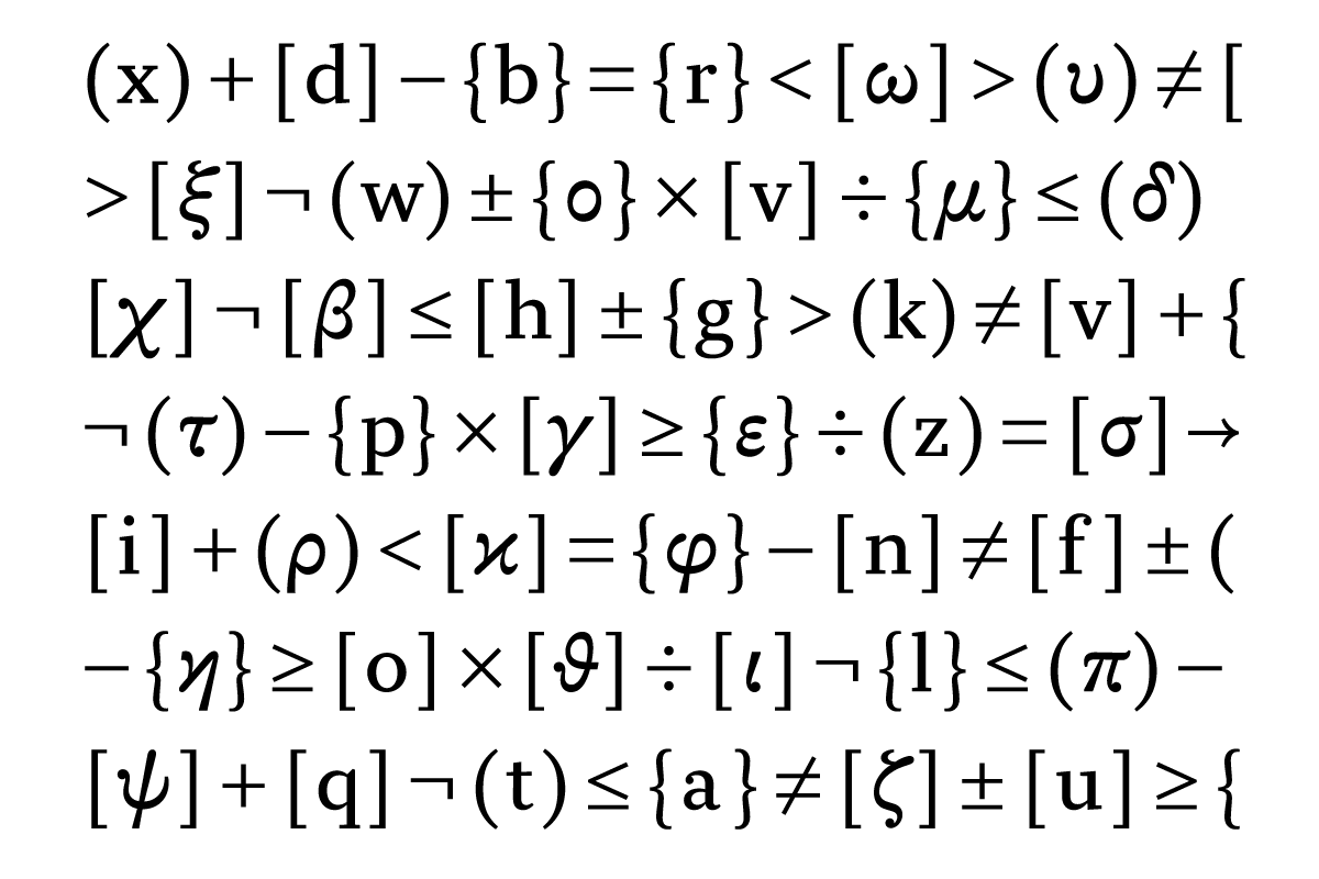
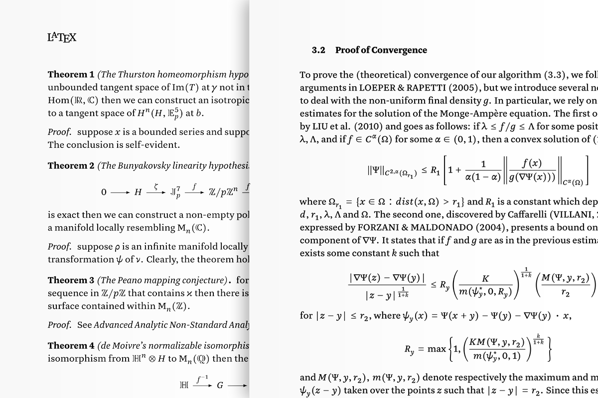
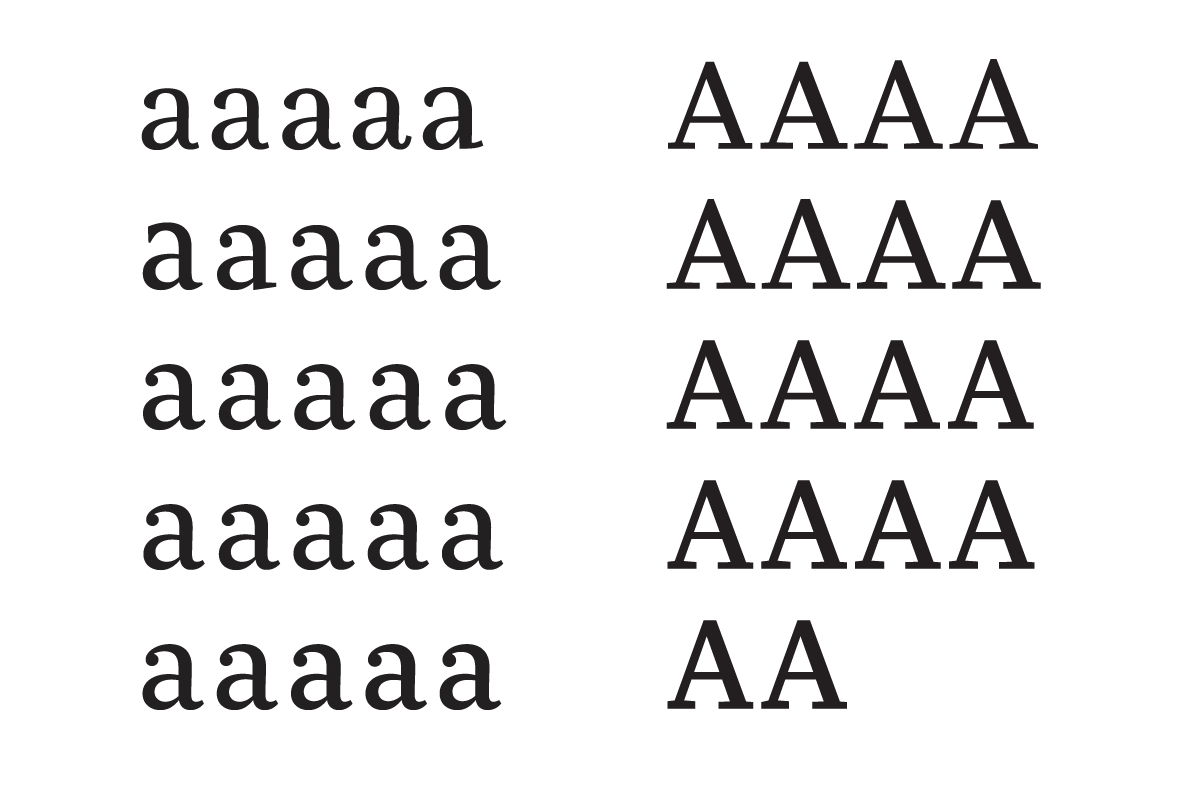
Lewis is a typeface designed for mathematical typesetting, specifically for the TeX typesetting system. It consists of 3 text styles (Roman, Bold, Italic) and 3 math styles (Math Italic, Greek, Blackboard) for use as variables. The text Italic relates to the Roman while the Math Italic stand out with its cursive construction. Likewise, the Greek differentiate easily from latin characters. The Blackboard inlines are adapted for text sizes with their wide and open cut. Lewis features many size variants and extending shapes, ideal in displayed equations.
Canada
Alexandre Saumier Demers
Alexandre Saumier Demers is a type designer and co-founder of Coppers and Brasses, a type foundry established in Montreal. Together with his partner Étienne Aubert Bonn, they share an interest for type design, programming, lettering and stone carving. Alexandre studied graphic design at the Université du Québec à Montréal before completing the Type and Media MA at the Royal Academy of Art in The Hague.
process
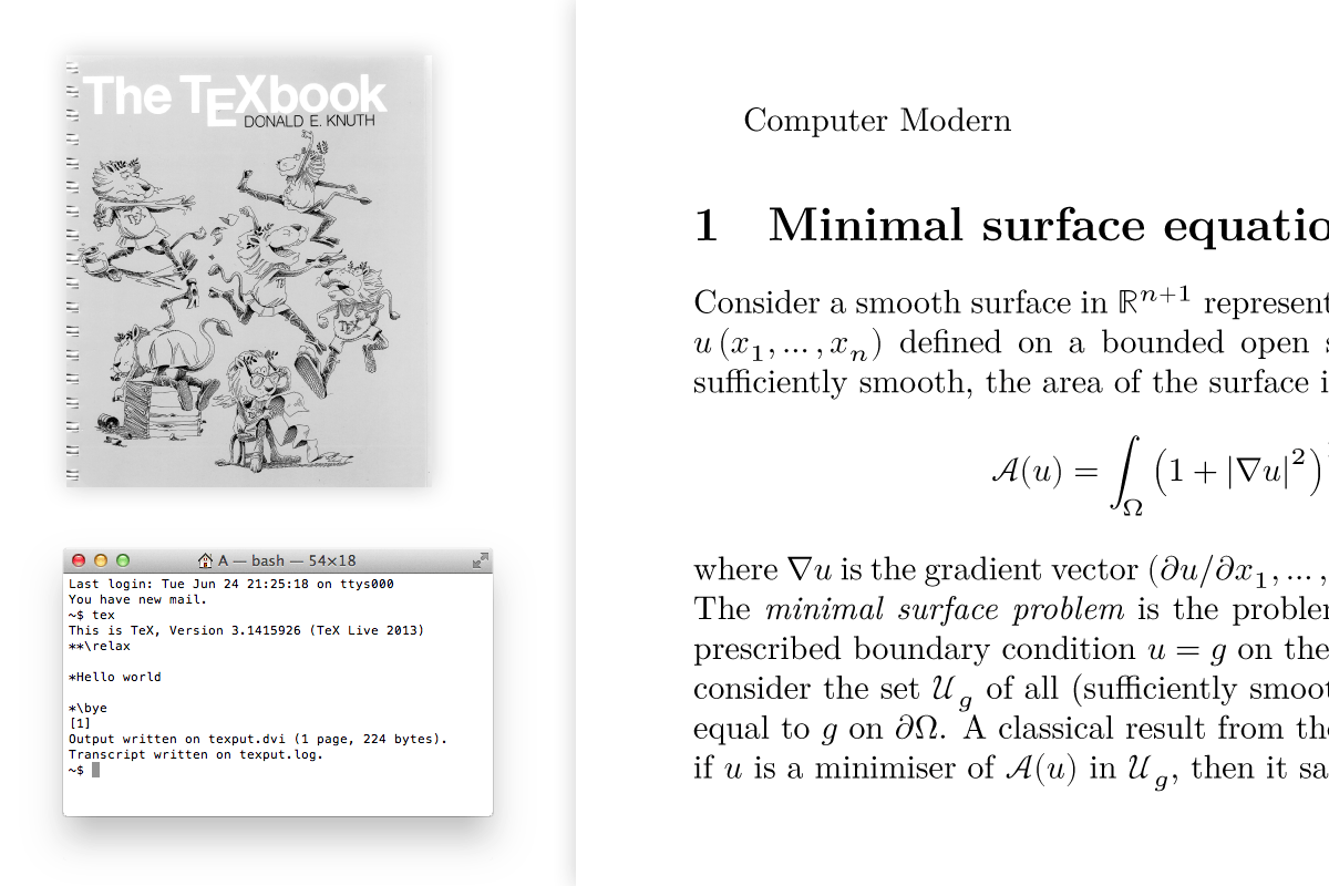
Learning to typeset mathematics was the first step and the most crucial part of my project. I bought a copy of the TeXbook and quickly fell in love with the simplicity and potential of the language, especially with Donald Knuth’s writing enriched with humour, creativity and wisdom. I started to use LaTeX for typesetting formulas, a document preparation system and markup language.
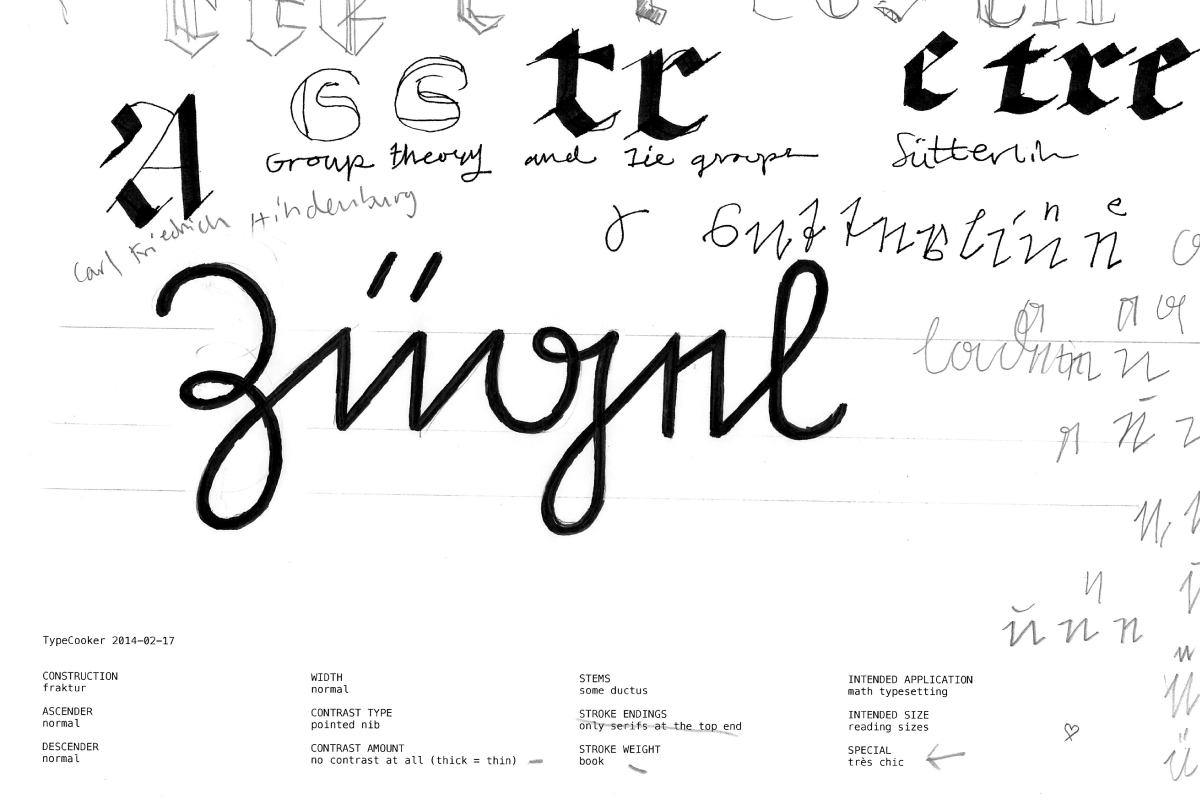
For the first sketching phase, I used TypeCooker to explore different styles and avoid restricting my design to preconceived ideas. At one point I adapted 3 of the 12 parameters to fit my project goals. Then I would progressively fix each setting to conceive my own recipe. It was a good way of writing down the brief and keeping design features consistent.
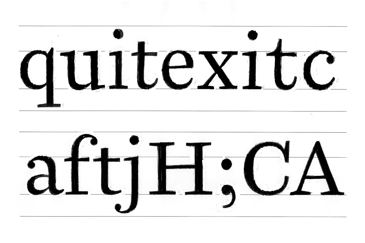
My sketching process involved some marker pens and a lot of Wite-Out. I started with the roman, while thinking about the italic because of its special context in mathematics. Used for variables in text and formulas, italic letters stand on their own and therefore need to be different in proportion and weight. Instead of blending in, they can stick out to a certain degree.
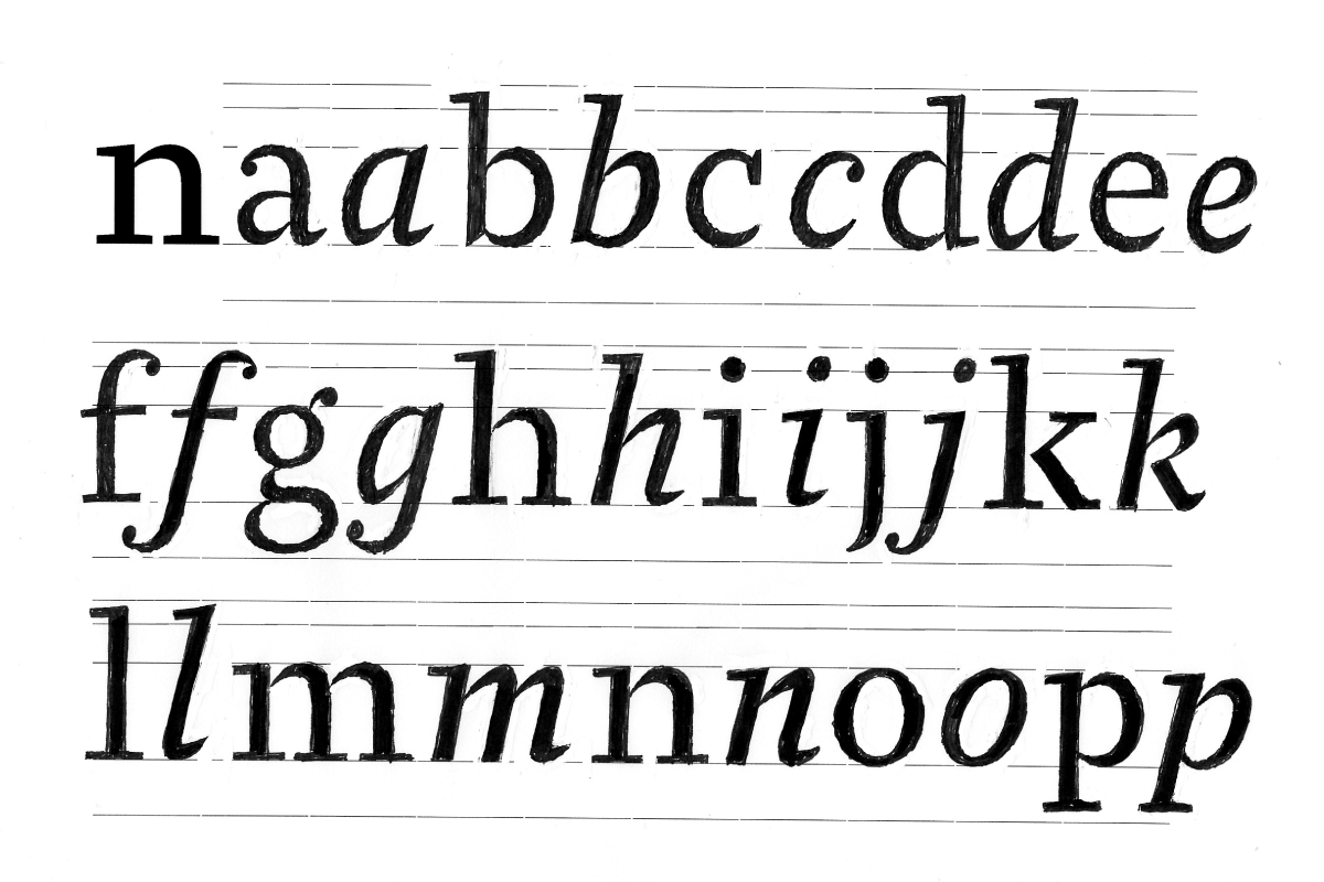
I first designed my math italic to make it work in text. I eventually realized it could not perform in both cases without being wrong in one. I finally decided to take advantage of the problem and go beyond minimal adjustments. My typeface would have two distinct italics, one to blend with the roman in text and serve as a second voice, and one making full use of cursive forms to express the importance of single letters.
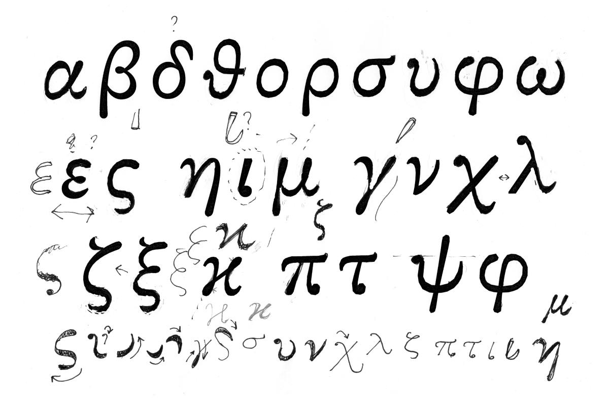
Since the Greek letters would be used as symbols and carry a specific meaning, they could not borrow too much from the roman. Letters like alpha, nu and upsilon can sometimes look like roman a, v and u respectively. I practiced my handwriting and looked at different Greek designs, especially earlier models, to study original forms that were not too influenced by roman typefaces. I felt quite intimidated to work on a foreign script with little experience. Luckily, I had to treat these letters as symbols and make them recognizable by mathematicians, not native speakers. I could focus on designing a distinct group of shapes that did not require text comprehension.
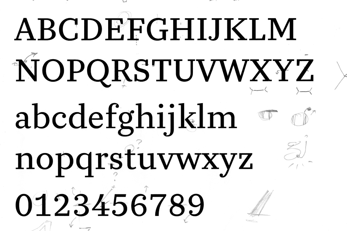
Many problems had to be fixed in the text styles. The serifs were too long, the contrast was inconsistent and the weight was not dark enough for text. When I look back at older files I am surprised I did not see what was wrong right away.
At the beginning of my project, I developed a script to keep a daily archive of my files. This image shows an overview in time of the development.
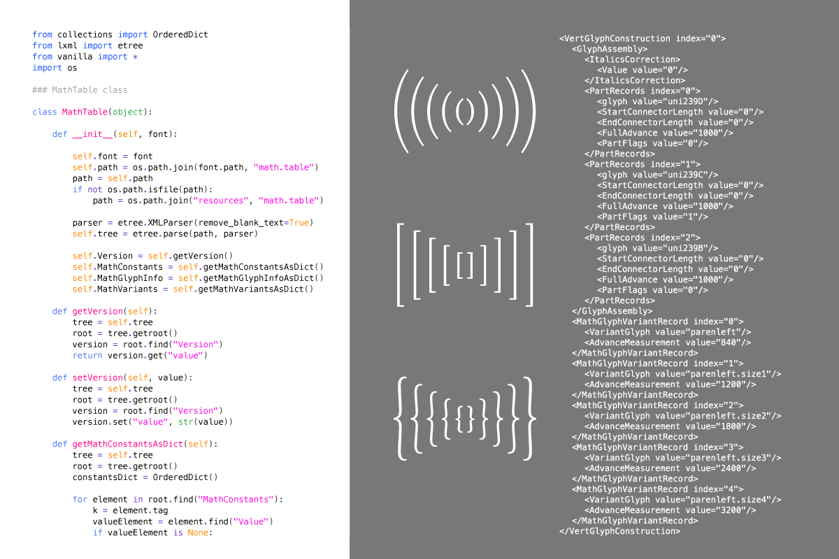
I was interested in the OpenType Math table and its recent support in TeX, which seemed like the best solution for my workflow. I could use python to generate all the XML then compile it into an OTF with TTX.

I developed my own extension using vanilla and RoboFont. Then, in a few seconds, I could edit all the math constants, add new glyph variants, or set some italic corrections to my typeface. This was a very exciting moment in my project, as it combined all my research and design efforts into a working font.
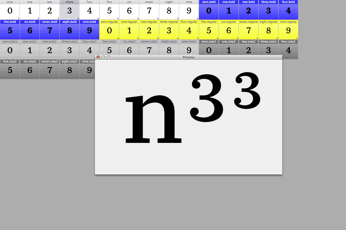
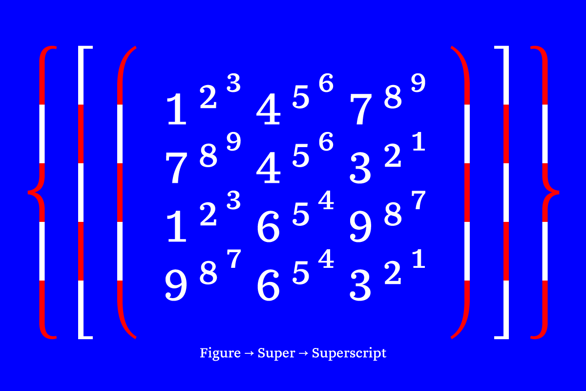
I developed a smaller extension to help me design the special script style. In a math font, they are the same height as normal figures, and scaled by the typesetting system. The extension was reproducing this environment. I used the Bold weight to interpolate the two levels of sub and superscripts to adjust the weight when scaling.


