
You are using an outdated browser. Please upgrade your browser to improve your experience.
Morris
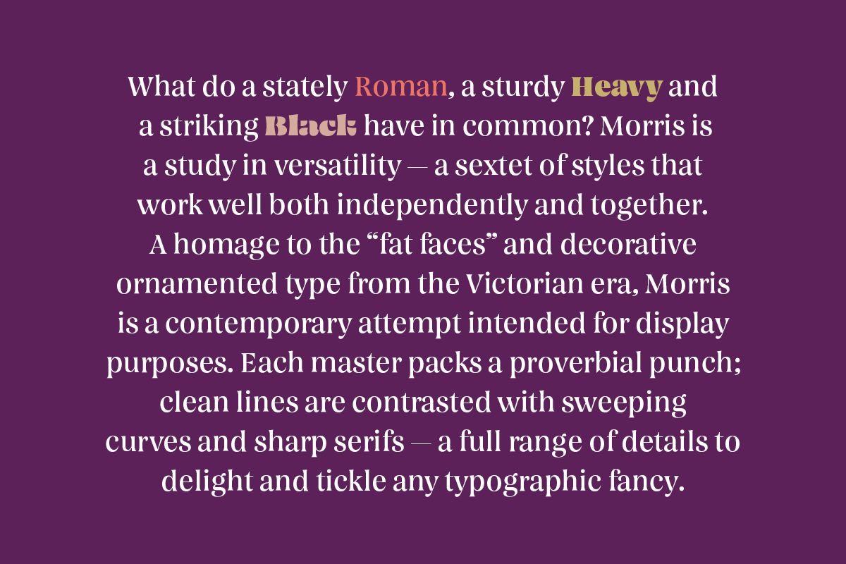
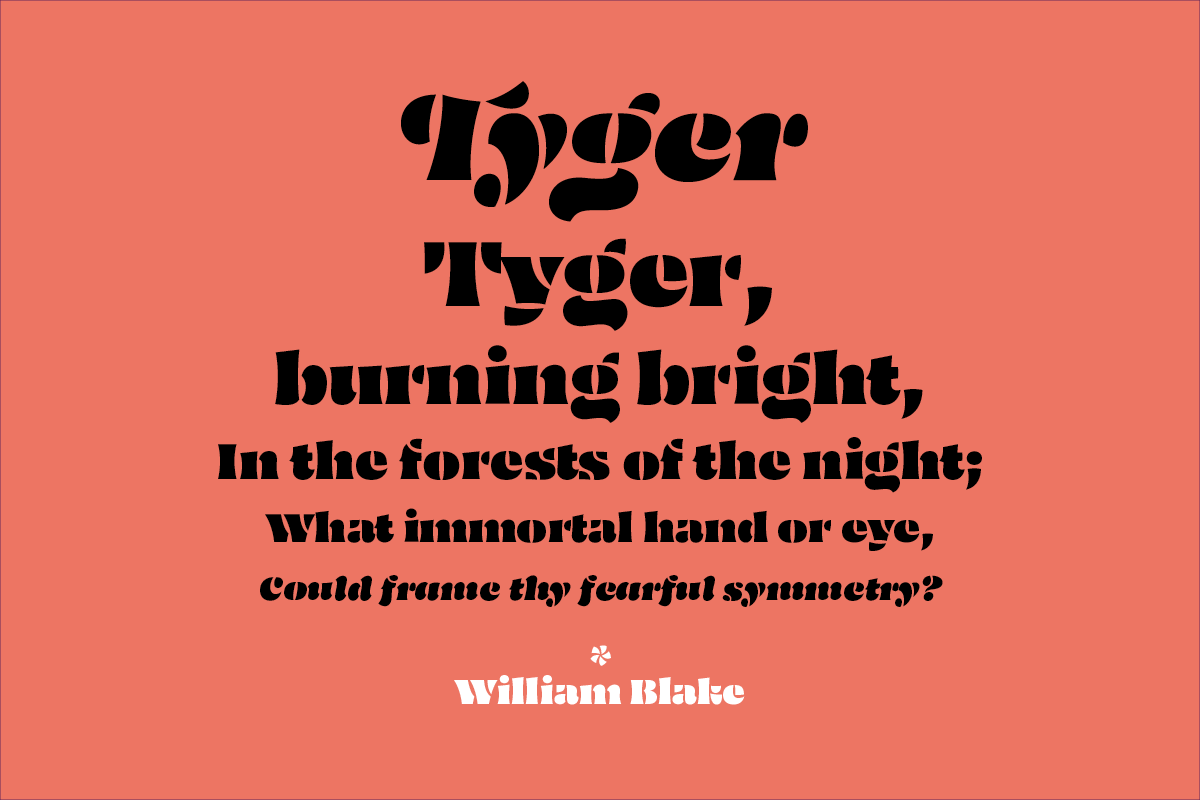
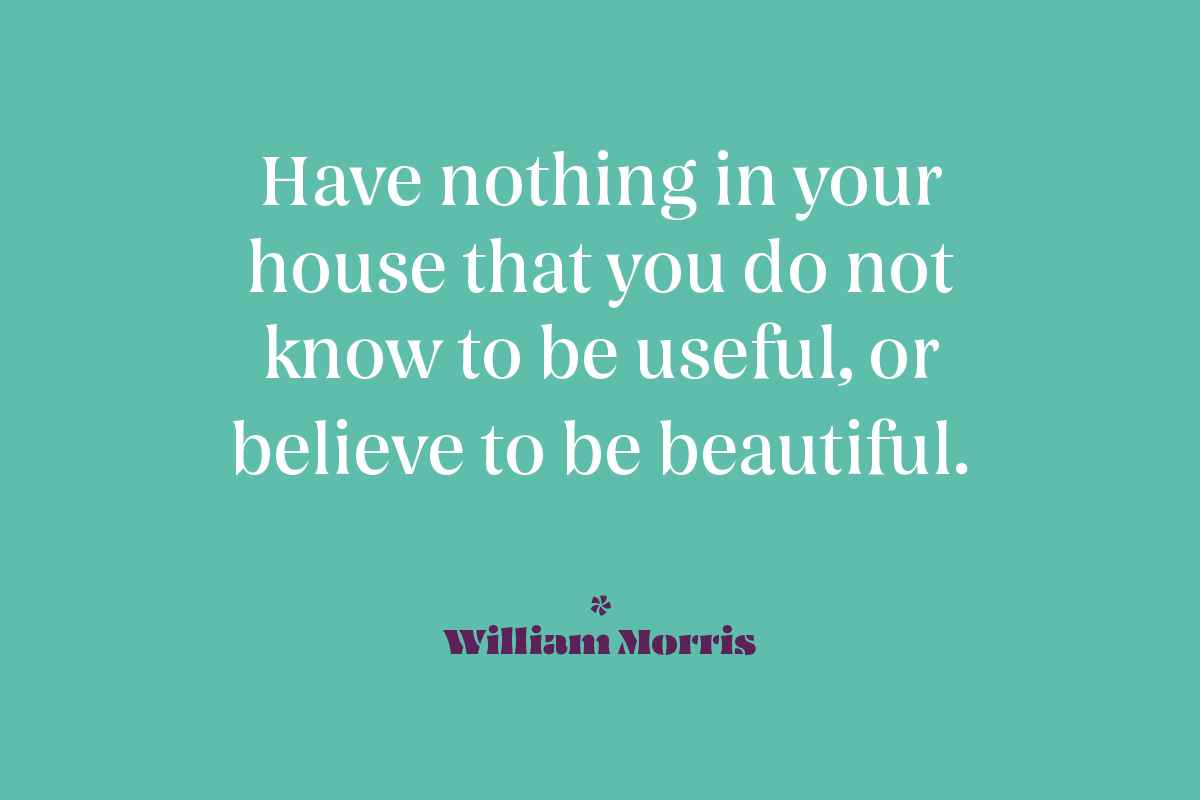
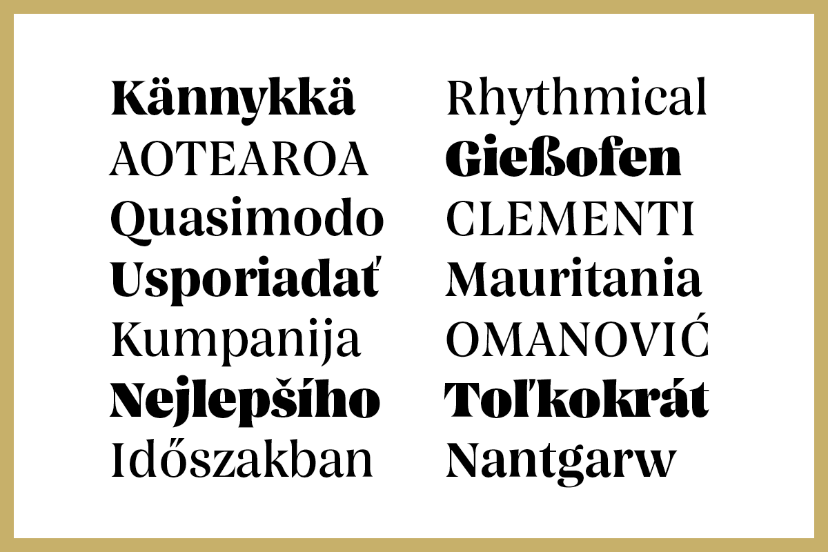
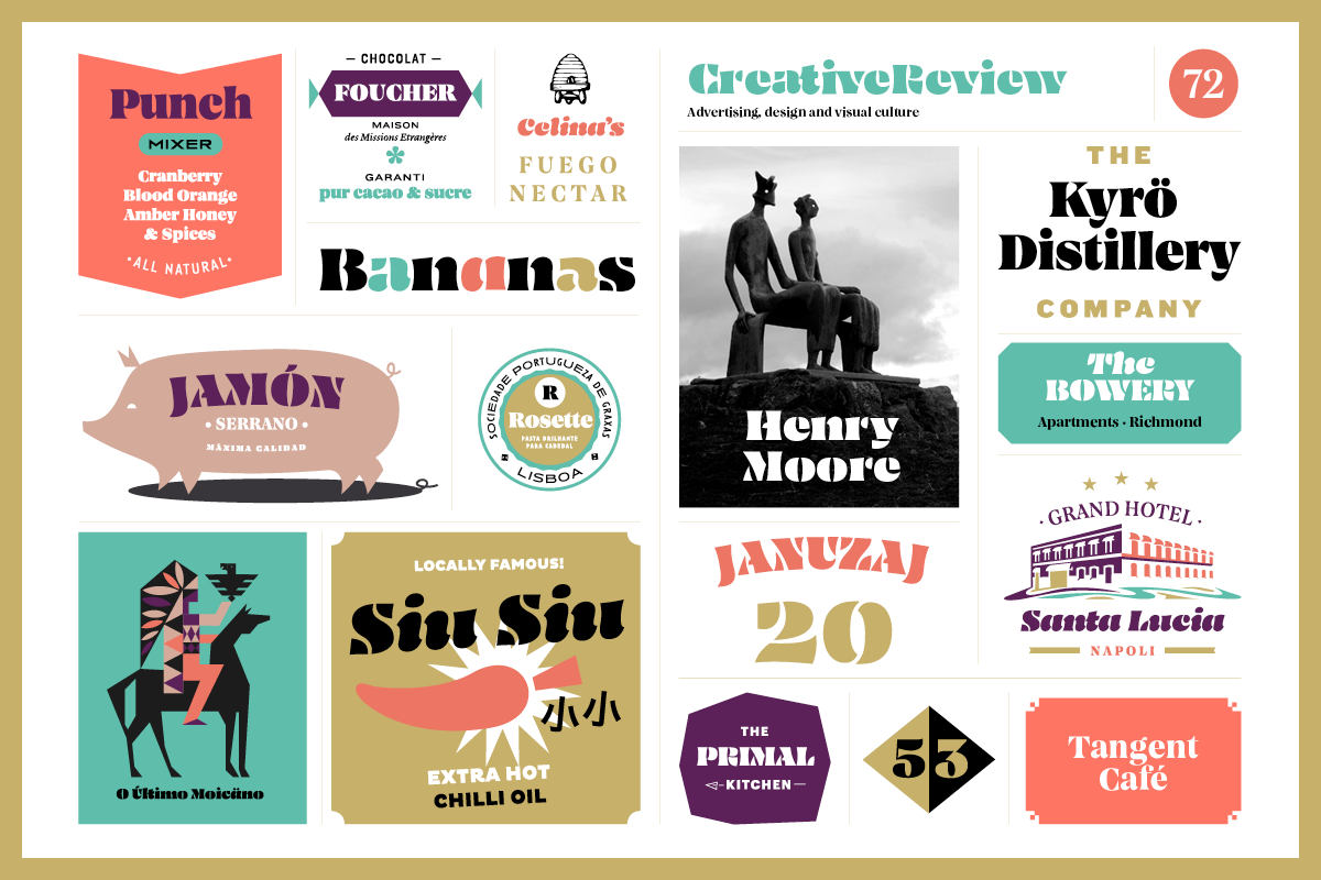
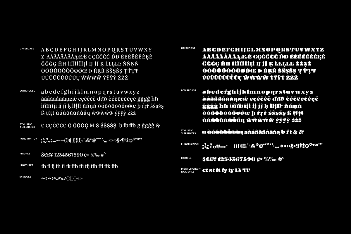
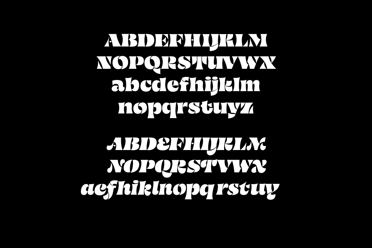
A homage to the “fat faces” and decorative ornamented type from the Victorian era, Morris is a contemporary attempt intended for display purposes. Each master packs a proverbial punch; clean lines are contrasted with sweeping curves and sharp serifs — a full range of details to delight and tickle any typographic fancy. Morris consists of 4 connected styles (Roman, Medium, Bold, Heavy), which are complimented by 2 striking stencil styles (Black, Black Italic).
Singapore
Mark Yehan De Winne
Mark De Winne is passionate about typography, education and type design, and like any Singaporean — food. After graduating from Temasek Polytechnic and Lasalle College of the Arts with a BA(Hons) in Graphic Design, he worked as a book designer and educator for 3 years, before starting Relay Room a typography-led creative studio he co-founded with his wife in Singapore.

process
I set out to create a type family for display. I was inspired by the ornate and often odd letter shapes and constructions of display type from the late ninetieth century. My plan was to use TypeCooker to inspire new variations on these shapes — so I made a simpler, more focused version to work with.
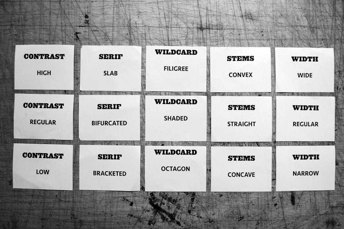
I was particularly drawn to stem ductus as a parameter to play with. Out of my early drawing experiments with this, I found a strange affinity to the shapes featuring concave stems and construction. While attempting to take the contrast up a notch, I created a few stencilled forms, which would become the basis for the Black and Black Italic styles.
The stencil shapes were fascinating. The constraints within the construction and idealised “type recipe” were infuriating. The letters had to find the holy grail of simplicity and legibility. Frustrated with my lack of progress with the roman, I started delving into an italic style as an experiment that eventually (and inevitably) provided many solutions for the roman stencil.
While I had been attempting to draw other display variants that played around with stem ductus, the letters with concave stem ductus (at this point, all stencil styles) seemed to work the best. Shown here are the results from the first month — definitely a work in progress!
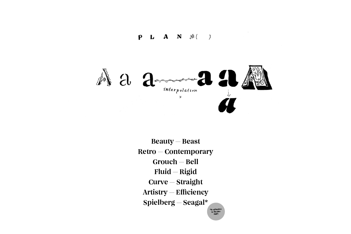
Since TypeMedia requires a minimum of three typographic masters, I started to redefine my family plan. In order to make the (eventual) family more useful, I planned a high contrast connected style that I hoped to interpolate later. I also kept a series of keywords that described in vague detail some of influences and ideas I had for the family.
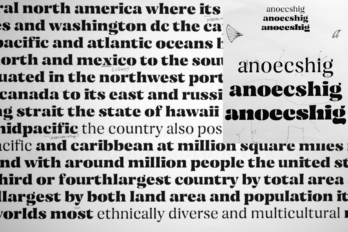
Many refinements would be made over the next few months. Each of the three (vastly) different masters had to relate to each other, work together and yet stand alone to scrutiny by my teachers, my classmates and my own eyes and expectations. The stencil style in particular kept changing, as I looked for the right solutions that matched the other two masters.
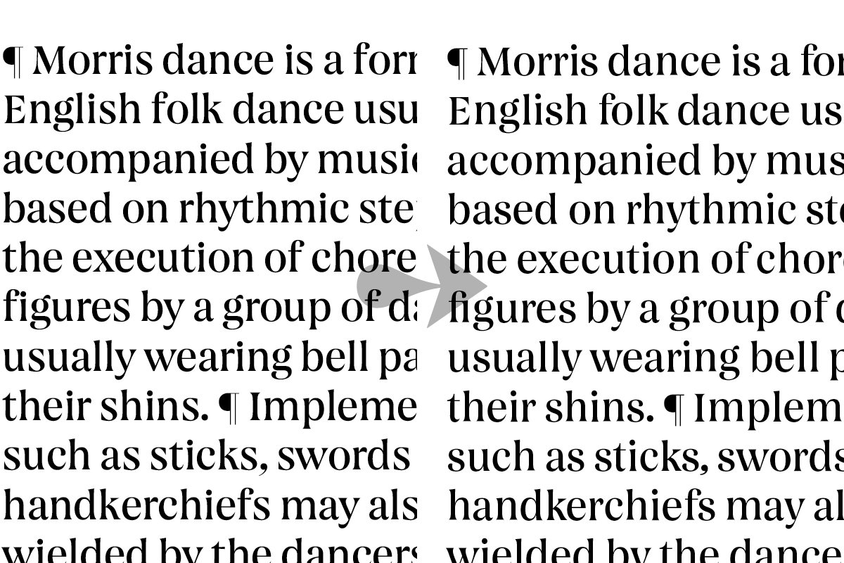
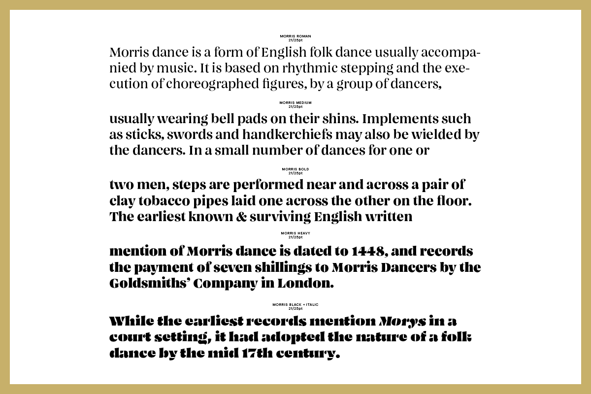
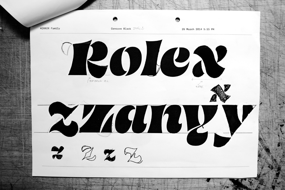
They say that “it’s all in the details”, and for Morris, that definitely proved to be the case. Every shape will be scrutinised and potentially used LARGE, and yet they cannot break when used for passages for text. Shown here is the evolution of the Roman style; the text on the right is the final outcome.
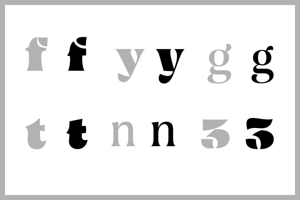
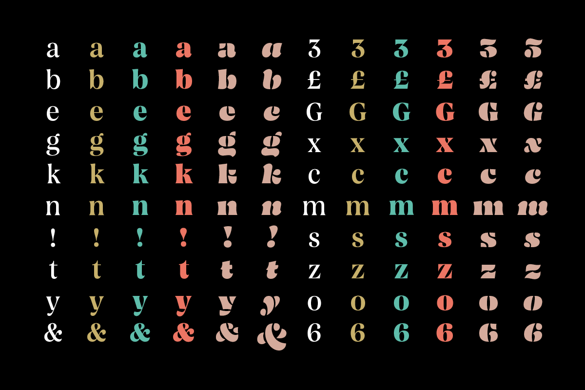
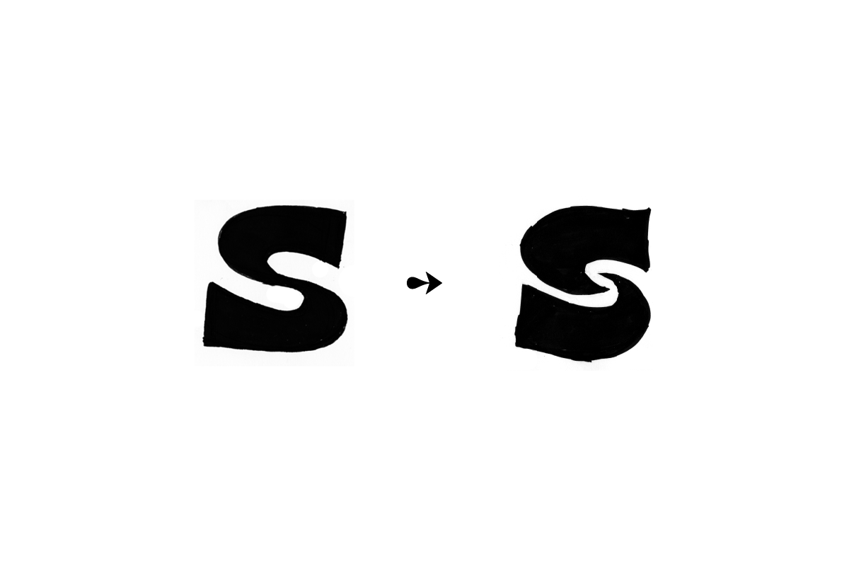
A selection of glyphs that show the “before vs after” versions of several letters. Details like the open tail of the “g” cross reference the detailing the Black (Stencil) styles; whereas other shapes evolved for legibility, spacing and aesthetic reasons.
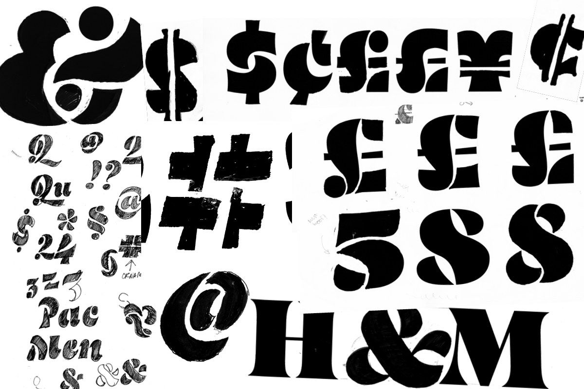
Drawing and sketching is key to the TypeMedia experience, and I eventually learned to embrace it wholeheartedly. In particular, sketching was an invaluable tool in solving numerals, punctuation and symbols in the stencil styles. Don’t leave home without a sketchbook, a marker and some white-out!
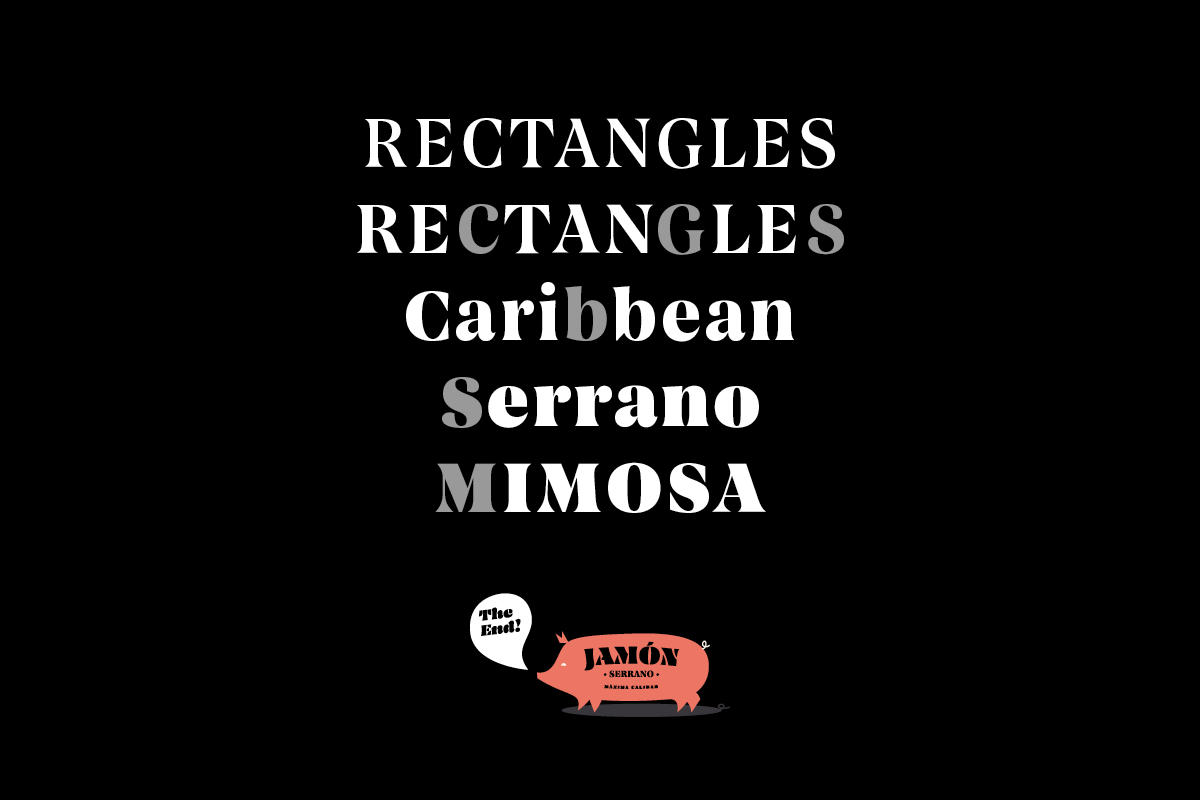
Quite a few letters feature stylistic alternates. Far from being indecisions about letter shapes, I drew on my experience as a graphic designer, where having alternates can be a real boon in creating different feelings. As always, 10 slides will never be enough to showcase all the work. I’d love to hear from you if you’re interested in the lengthier process.


